Publications Page

A New Way to Feature news and announcements

The Publications Page was added to the Arts & Sciences web theme with some goals in mind.

We needed...

  • A home for departmental newsletters on the website
  • A more dynamic layout for news articles or blogs
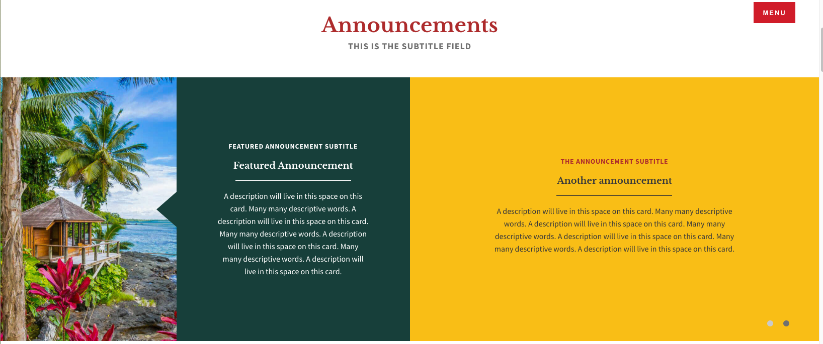
  • A way to present brief announcements without the need to click into an Article

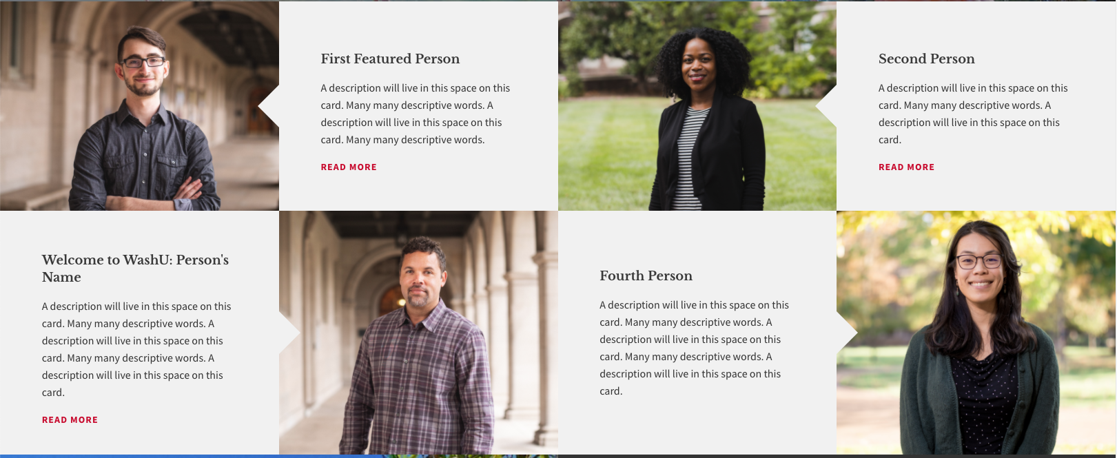
The new page was designed for flexibility so section titles are editable, most fields are optional, and all sections are optional. In other words, if you do not add content to a section, the section will not display. Additionally, once your department website has this content type "turned on," you will be able to make as many Publications pages as needed.

Get Inspiration from these Publications Pages:

EPS Newsletter   History Newsletter

Optional Sections on a Publications Page

Intro | Table of Contents | News | Announcements | Video | PeopleTestimonial | Gallery | Awards | Degrees | Student Stories | Twitter | Call to Action


 Intro Section

For the top of the publications page, you have the option of using either the "Standard" Intro Section or the "Featured News" section. If no content is added, the next section containing content will display at the top. Whichever intro type you select, it will be important that you select articles with images!

Standard Intro:

  • The section title and subtitle are editable
  • This section will display four article teasers
    • The three on the right pull in title and thumbnail image
    • The main article displays the header image and teaser text
    • All four articles display their taxonomy terms (categories) in red above the title

Featured News Intro:

  • The section title and subtitle are editable
  • This section will display two articles
    • Both articles use the thumbnail image and teaser text
    • The size of the image display is dependent on the size of the photos uploaded to the articles.
  • If Featured News is being used in the intro section, this section will not show further down the page.


 Table of Contents Section:

  • On the left side, you may create anchor links to other sections of the page.
  • The right side is a text area in which you can enter text or images using the wysiwyg toolbar.


 Announcements Section:

This example uses 3 announcements; a featured announcement on the left and 2 rotating announcement slides on right
  • The section title and subtitle are editable
  • Can be used with or without an image
  • Four options are available for announcement background colors
  • Featured announcement is "sticky" on the left. Other announcements rotate in a slideshow on the right.
  • You can have 1 featured and up to 5 "regular" announcements.
  • If no featured announcement is used, the slides will be full-width (example below)
This example does not use a featured announcement. Announcements are shown full-width.


 Featured News Section:

  • The section title and subtitle are editable
  • This section will display two articles
    • Both articles pull in the header image and teaser text
  • If Featured News is being used in the intro section, this section will not show further down the page.


 Full-Screen Video Section:


 Featured People Section:


  • You can create between one and four featured people.
  • This section will have a different photo layout depending on how many people you use (see images above)
  • Images are required
  • Each entry has an optional ‘read more’ to link to another page


 Testimonial Section:

  • Choose a testimonial from the dropdown menu
  • The background behind the text is always dark grey
  • The color choices change the color of the circle behind the quotation mark


 Gallery Section:

  • The section title and subtitle are editable
  • Can use one, two, three, or four images
    • Will have a different photo layout depending on how many photos you use
    • Images are required
  • Has optional caption and full description fields
  • The caption will display as an overlay when the visitor hovers their cursor over the photo
  • When photo is clicked on, a lightbox will open and display the photo, caption, and description
  • The lightbox display will accommodate both horizontal (landscape) and vertical (portrait) photos.


 Awards Section:

  • The top of this section provides an editable title, subtitle, and optional button.
  • This section requires a minimum of three awards be listed. 
  • Each award has fields for name, title, description (limit of 240 characters), and an optional ‘read the story’ link

 Degrees Section:

  • The section title and subtitle are editable
  • There are five color options for the background
  • Degree types are editable and display in an accordion style
  • Under each degree type, you can add a degree name, degree recipient, and a distinction (see below)


 Student Stories Section:

  • Can use one, two, three, or four student stories
    • Will have a different photo layout depending on how many students you use
  • Images are required
  • Provides fields for student name, title, and quote
  • The name and title will always display
  • The quote will display as an overlay when the visitor hovers their cursor over the photo


 Twitter Section:

  • The web team will set up the feed from your Twitter account
  • The description that displays next to the tweets is editable
  • A button displays that takes visitors to Twitter


 Call to Action Section:

  • The section title and subtitle are editable
  • Optional button and button text
  • Four background color options to choose from

Meet with the Web & Communications Team

Please note that the option to create a new publications page won’t be available in your site until after a consultation with our team.

Set up a Consultation