
The Home Page
On department sites, the home page options are very similar to those in the Multipurpose Page. There are a variety of optional content sections to choose from.
Some sections are designed to pull in content automatically, and others require you to add the content to the section manually. Only a few of these sections should ever be used at one time. Any sections left blank will simply not display to site visitors.
Slideshow Type
The Slideshow section allows you to choose what type of slideshow you want to display at the top of your homepage. You can choose up to five slides of the same type that will automatically rotate. If you want a static non-rotating image, then you should only add one slide. The slideshow options are:
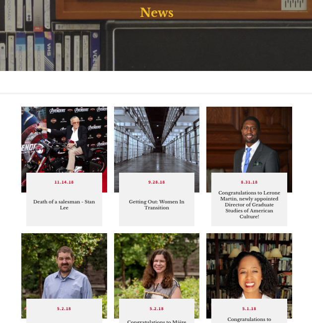
News

The news slideshow is populated by articles that have the 'Feature on Home Page' option checked on the individual article.
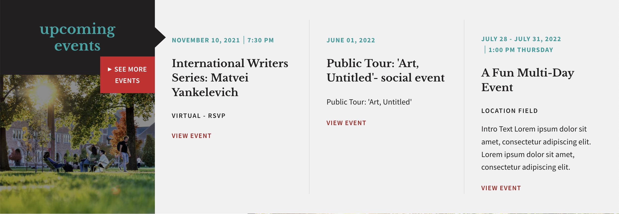
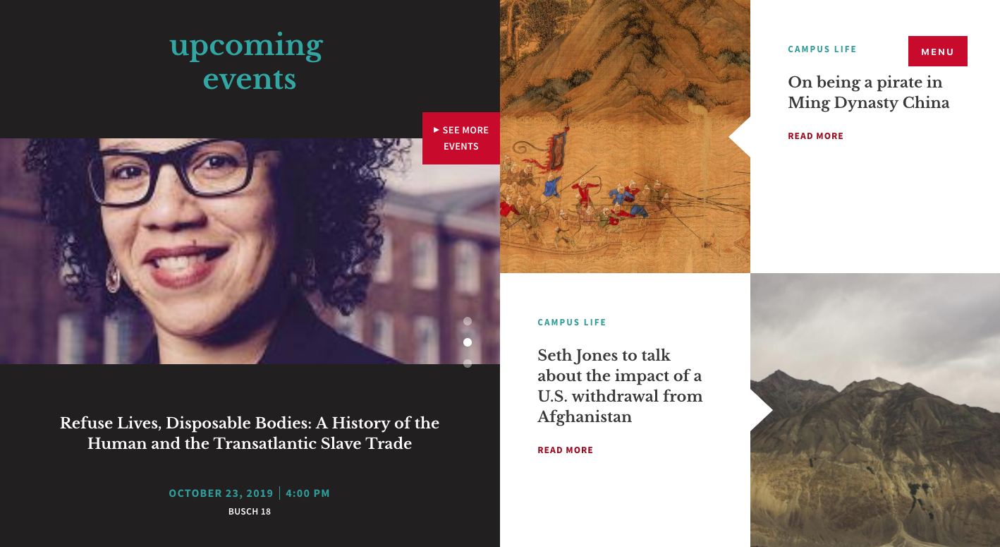
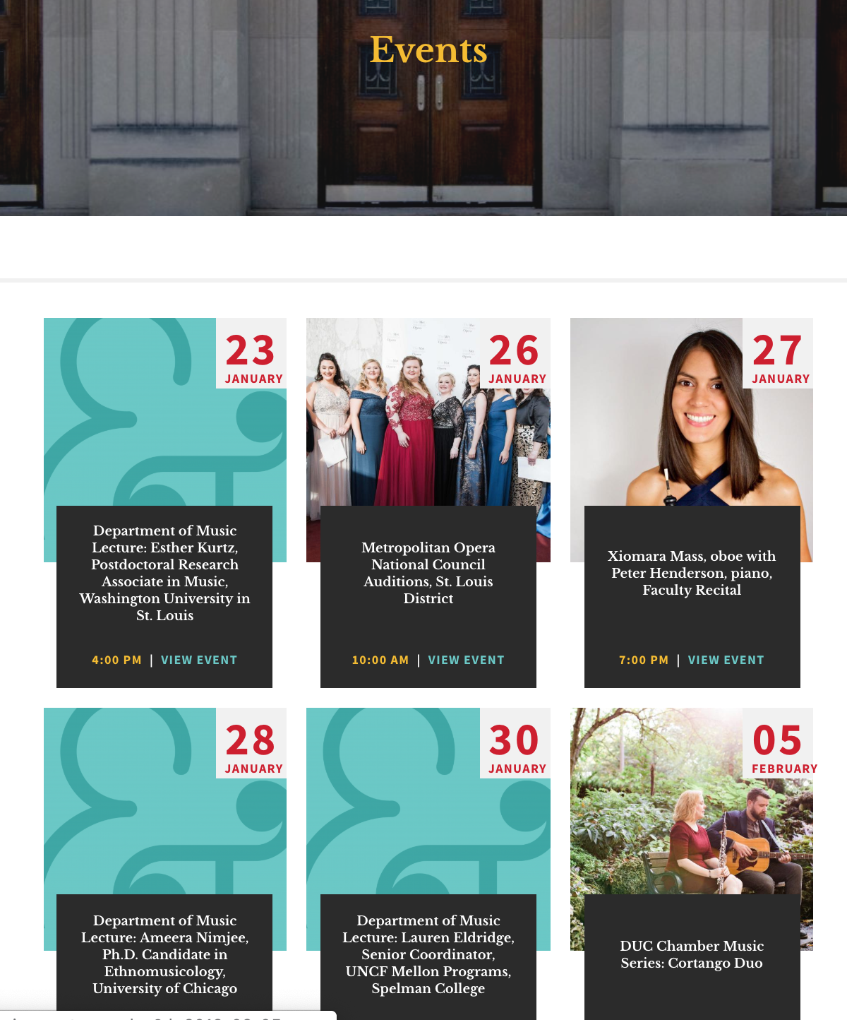
Events
The events slideshow is populated by events that have the 'Feature on Home Page' option checked on the individual event. The events in the slideshow will not drop off once the event date has passed. You need to manually uncheck the 'Feature on Home Page' option on the individual event.
Featured Full with Caption
Featured Full with Text
Featured half image w/ text
Links Section
Use this section to create links in the horizontal bar below the slideshow on your home page.

It is not recommended that you link to other websites from this section, but if you do, be sure to select the "New Window" checkbox so that visitors can easily return to your home page.
Best Practices
- Items should have succinct names (no longer than 2 words).
- Does not have to be the same as the main menu
- Should not go to 2 lines on mobile or desktop
Intro Type
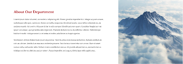
This option controls the top content section that is typically used for the "About the Department" text. This pull-down list allows you to choose from two layouts:
Intro text with side image
A WYSIWYG toolbar area on the left with an image to the right
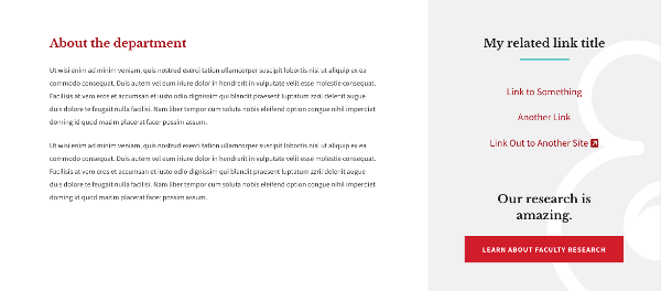
Intro text with related links
A WYSIWYG toolbar area on the left with a list of links to the right and an optional button link below the links. When entering the links, choose "Related Links" for links within your website. Choose "Related Link Out" for links outside of your website.
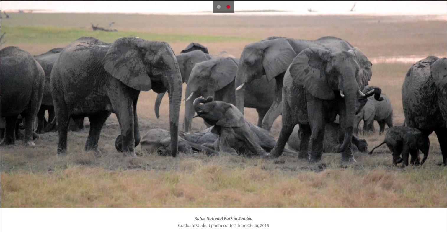
Full Width Slide
Use this section to display a full-width image or set of images with an optional caption. The slides rotate automatically, but a visitor can go to a particular slide by clicking the dots at the top center.
First Spotlight
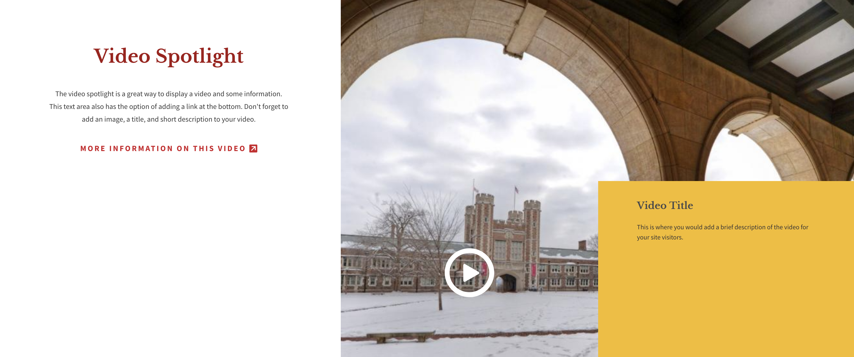
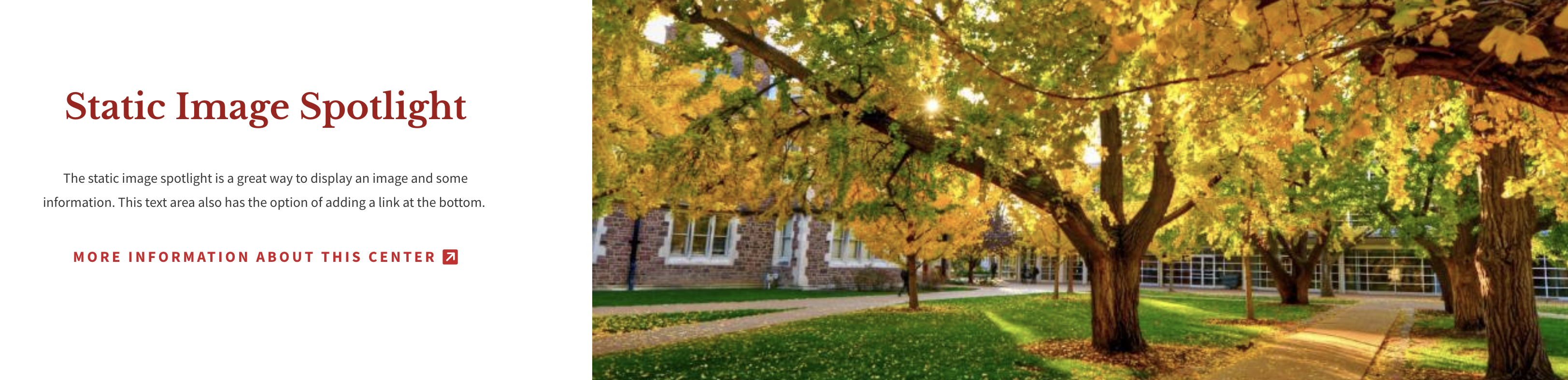
This is identical to the Spotlight section on a multipurpose page. Use this section to display one of four options: Video, News & Events, Static Image, or Full-screen Video.
Video Option
On the left side, the Video option has a WYSIWYG area for a description, link text, and a link URL. For the video URL, you must use the link provided under the "Embed" option on YouTube - not the URL in your browser's address bar (see the "Embed Video" FAQ in the Toolbar section of this page). On the right side, you can add a title, short description, and URL for a video. The video title and description will show up in a white field. You must add an image for the video spotlight to display.
Minimum image size: 800x800 or larger.
Static Image Option
On the left side, the Static Image option has a WYSIWYG area for a description, link text, and a link URL. On the right side, you can add an image.
Minimum image size: 800x800 or larger.
News and Events Option
The News and Events option lets you display the most recent event and two articles by taxonomy term. The events will show up on the left side and the news will be on the right.
Full-screen Video Option
The full-screen video option has a video, video splash image, and fields to add a video title and short description. Please see the "Using YouTube Videos" page for instructions on using a YouTube video.
Minimum image size: 1366x800 or larger.

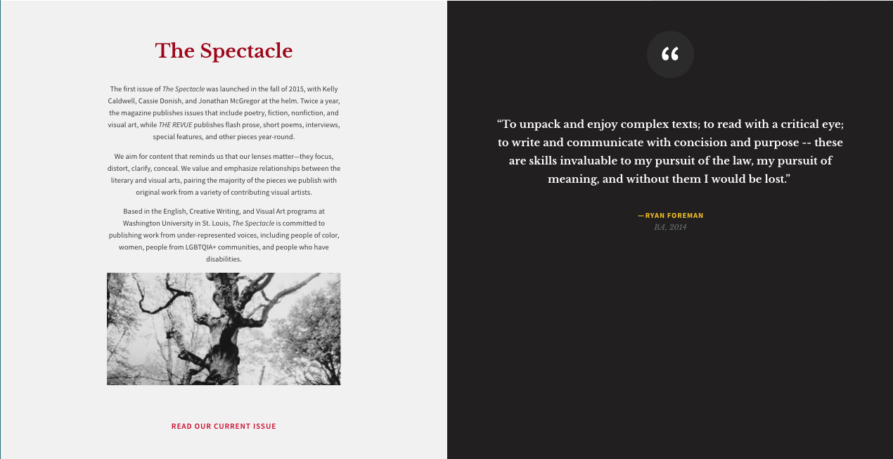
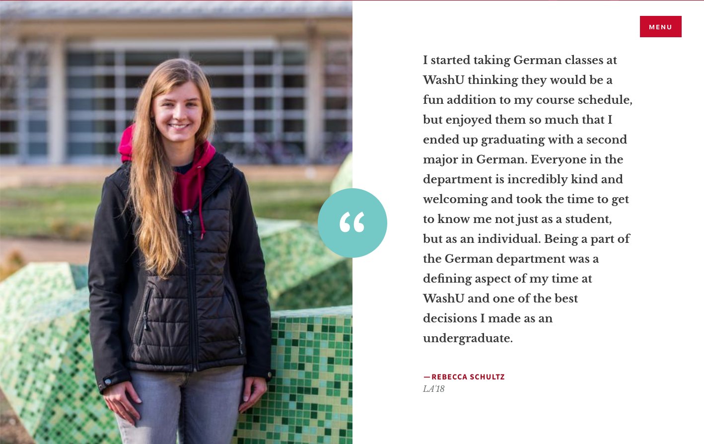
Half Text and Half Testimonial
The left side of the section has an area for a title, body/text, and optional link and link text. You can also choose a background color for the text area.
To add content to the Testimonial section on the right, click on "Add new paragraph" and type in the text of the testimonial and the name and title of the person from whom the testimonial came. You can also choose a background color for the testimonial text area.
Events
This section will display one, two, or three events that you choose from a list of your existing events. If you choose not to upload an image, the default blue ampersand logo will display. These events will not drop off automatically once the event day has passed. They have to be manually taken off or replaced.
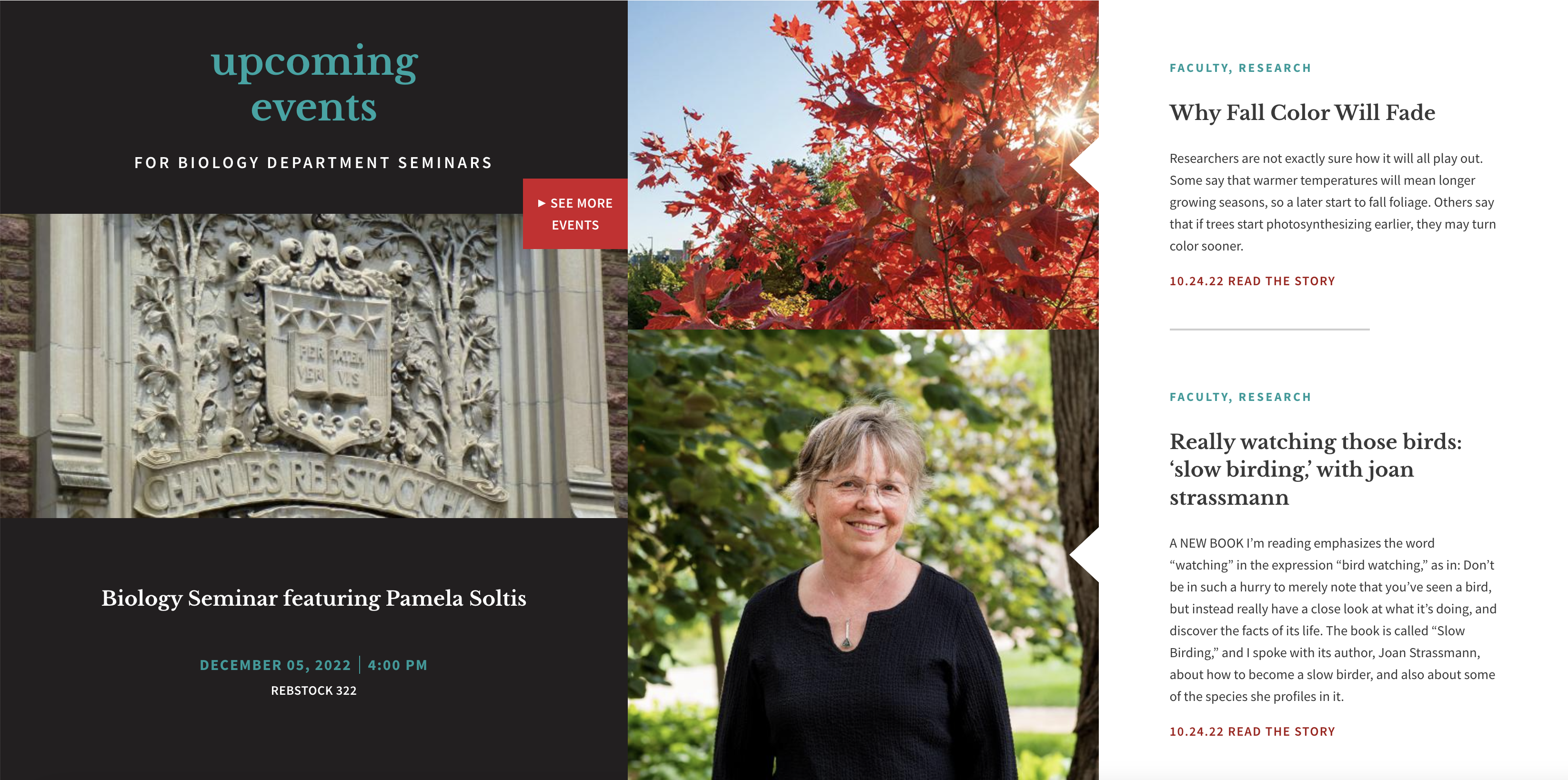
Upcoming Event and Two Articles
This section will display a slideshow of the next three upcoming events on the left and two articles that you pick from a list of your existing articles on the right. The events will change automatically when dates pass. The header image will display with the events. If there is not a header image, a default image will display instead.
The default image for this area is the "Department image" which is also displayed on the lower right column of a (long) person profile. This same image is used on the main Arts & Sciences website to represent your department in the "Explore Academics" section of the site.
Testimonial
This section displays a testimonial that is chosen from a dropdown that contains all existing testimonials on the site.
Testimonials are a content type, so to create a new one, you must go to Add Content -> Testimonial.
Instagram* and Twitter
This section will display a feed from Twitter. When your site was created initially, we set up your feed for you. Contact the web team if you want to add a new Twitter feed.
*The feed from Instagram is no longer working after a back-end change made by Instagram. 
Best Practices for Content Management
- Any promoted/ featured event or news article should have a thumbnail image.
- There should always be an image or slideshow at the top of the home page.
- Guidelines for the Links Bar
- Items should have succinct names (no longer than 2 words)
- Does not have to be the same as the main menu
- Should not go to 2 lines on mobile or desktop
- The “About” section should always be at the top of the page, just under the slideshow.
- Do not use images with words on them because they are not accessible to screen readers, the text cannot be indexed by search engines, and it is not mobile-friendly.
- Try to update homepage content on a monthly basis. Refresh the top image or slides and any news or events.
- If you do not have any upcoming events, don’t use a section that automatically pulls in an upcoming event. Ask us if you need help figuring out a new layout that doesn't include that section.
- If you are featuring events in the slide show at the top of the page, make sure you switch it out after the event has passed. This section does not automatically change out events that have passed, and leaving old content up on your homepage looks bad to visitors.
- Do not use more than 3 or 4 sections on the homepage. This page is meant to be a welcome/ quick overview of the most important content.
Creating New Content
Updating and adding new content to your website is an ongoing project. We have a checklist to help you with planning throughout the year.
A single website could contain many types of content, such as basic pages, news articles, events, or web forms. A content type defines certain settings, such as layout, available fields, which taxonomy terms (tags) are available, and more.
After logging into Drupal, find the ‘Add content’ link within the grey shortcut bar at the top of the page. After clicking it, you will see a list of the content types that you have permission to create. Click the type of content you want to create (e.g. event). Complete all form fields. Required fields are marked by an asterisk. When you have finished adding content, click the Save button at the bottom of the page.
Below is a list of all of the available content types in the Arts & Sciences web theme with descriptions and helpful tips.
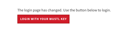
Logging in
The login page for any Arts & Sciences website follows this pattern: https://(yoursite).wustl.edu/user. In other words, go to your website and just add "/user" to the end of the address following the "edu" then just click the red button to log in with your WUSTL Key.
Article
Article is a shared content type.
Use Articles for time-sensitive content like news, press releases or blog posts.
Where are some places where an Article can display?
- All published articles will automatically appear on the news landing page.
- In the Featured News header slideshow option on the home page or news landing page.
- Any section in the home or multipurpose pages that allows you to pull in articles.
- In the auto-populating In the News section at the bottom of a long person profile.
News Landing Page layout options
The News landing page can be set to display your news articles in a list or card layout. If you would like to change your layout, please contact the web team.
Learn more about creating an Article
Basic Page
Use this for your static content, such as an 'About Us' page. A Basic page has five sections available to use. You do not have to use them all. Any sections left blank will simply not display to site visitors.
Introduction
- Headline (optional)
- Description (optional)
- Background image (optional)
- Choice of red, dark, or white background-color
- The choice to display an ampersand image (optional)
Content
- Title (optional)
- Body area with WYSIWYG toolbar (optional)
- background color (optional)
- Page format choices
- single column
- two columns
- single column w/ sidebar menu
Call to Action
- Title (optional)
- Description
- Button (optional)
- Background color (optional)
Content
- Title (optional)
- Body area with WYSIWYG toolbar (optional)
- Background color (optional)
- Page format choices
- single column
- two columns
- single column w/ sidebar menu
Footer Callout
- Body area with WYSIWYG toolbar (optional)
- Background color (optional)
- Social Media Links (optional)
- Button (optional)
Book
Book is a shared content type
Where will a Book display?
- A book can display above the footer on a Person page that has the "Long" format chosen (usually for faculty) when that person is tagged on the Book page. If multiple books are tagged with the same person, the books will display in a rotating slideshow.
- In a Bookshelf, which is an optional section on a multipurpose page. Not every site will use this feature as it requires a minimum number of books (around 6, depending on cover image sizes used) and not all departments have that many. You have the option to create multiple bookshelves (one per multipurpose page) and to use categories to determine which books display on which bookshelves. For example, you could have a Faculty Bookshelf that displays only books tagged with the "Faculty" category and an Alumni Bookshelf that displays only books tagged with the "Alumni" category.
Creating a new book
- Go to Add Content and select Book
- Title: Fill in the title of the book
- Byline Options: Select the appropriate option for the Byline. The options are
- By
- Edited by
- Translated by
- Faculty and Staff: Begin typing the name of a faculty member for whom a profile ("Person" content type) has been created in your site. A list of names will appear in a drop-down below the field from which you can select the author of the book.
- To add a second author who has a profile in your website, type a comma and add the second person's name in the same way.
- Byline Names: Only use this field if you need to add additional authors who do not have profiles in your website.
- Book Cover: Upload an image of the book cover
- Files must be less than 8 MB.
- Allowed file types: png gif jpg jpeg.
- Images must be larger than 200x450 pixels.
- Description: Fill in descriptive information. Please try to keep the description to around 100 words.
- Links: Add links to the publisher's website. You can create multiple links if there is other associated material such as a book website or related volume. Do not link to Amazon unless you cannot find the book on the publisher's website.
Event
Event is a shared content type.
Use Events to announce an upcoming event, allow a visitor to RSVP to an event, or get directions to an event's location.
Where are some places an Event can display?
- All published events will automatically appear on the Event landing page.
- In the Featured Events header slideshow option on the home page or event landing page.
- Any section in the Home or Multipurpose pages that allows you to pull in events.
News Landing Page layout options
The News landing page can be set to display your news articles in a list or card layout. If you would like to change your layout, please contact the web team.
FAQ
An FAQ page offers the option of adding multiple sections distinguished by headings. Under each heading, the FAQ titles will display. When a visitor clicks a title, the page slides down to reveal more content. Each heading becomes an anchor link in the right column, to allow visitors to navigate quickly to a specific section. The page you are on is an FAQ page and this answer is one FAQ in the "Creating New Content" section.
TIP: Do not include tables in an FAQ. They will be cut off and your text will be unreadable.
How to Re-order FAQs and FAQ sections
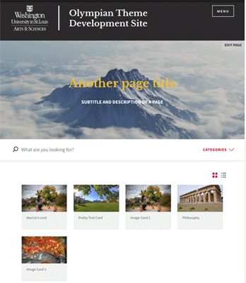
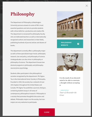
Image Card
This content type goes by many names. On Department sites, we named it "Image Cards," On University College, it is called "Programs," and on Artsci and Graduate School, it is called "Departments & Academics."
The content requires an image and displays it in a grid on a lading page. When clicked, the card opens up in a lightbox with more information
Examples:
https://music.wustl.edu/browse
Learn more about options on the Image Cards Landing page in the Landing Page FAQs below.
Multipurpose Pages
A multipurpose page is made up of 20 optional sections and new ones are added from time to time. Each section has a unique layout and set of features. A section will only display if content is entered into it, making the multipurpose page very flexible.
Though the template is flexible in that each section is optional, the sections are not moveable. They are always displayed in the order shown.
Browse all Multipurpose page sections
Available sections in a Multipurpose page
This section has fields for a headline and description. You can also upload a header image and choose from a red, dark, or dark photo overlay. If you don't want to use a photo, you can choose a solid background.
Anchor Links
In the black bar section above the main content area, you can add anchor links. An anchor link will take your site visitor straight to another section further down the page. This makes essential information quickly accessible without scrolling.
Main Content and Sidebar
This is the first thing your site visitor is going to see, so it's important to use it wisely! It's a great place to introduce an academic area, a program, or give an overview. This area has a full WYSIWYG toolbar, so you can add links, inline images, and even video. One thing to keep in mind when using this section is that if you use all of the available sidebar options on the right, the left content area really needs to have enough content to fill it up. If it's not filled, you end up with white space at the bottom of the left side.
About the Sidebar
The sidebar can be static or turned into a simple slideshow with icons. If you choose not to use the sidebar, the text section will go all the way across the page. This section is divided into a left main content area and right sidebar.
Video Spotlight with Articles
This section can have multiple videos and two articles. The articles can be chosen from a list or a category. If you choose a category, the two most recent articles in that category will appear. You will also need a splash image for your video. In order to use the video section, your video must be hosted on YouTube.
Dotted Line
This section is helpful for illustrating areas such as program subsections or department majors and minors. You can add up to five dots and can choose between a red, grey, or white background color. As they click on the dots, the site visitor sees a brief overview of your program. If your description is not long enough, there are sometimes layout problems. They can click on an optional link to get more information.
The single image callout has one image and multiple slides with text and an optional link. A multi-image callout can have multiple photos and multiple slides with text along with the optional link.
Call to Action
This section is used to ask visitors to do something. Examples are to learn more about a topic, sign up for a newsletter, make an appointment, apply, or donate. The text is usually brief and to the point. You can choose between a white, red, blue, yellow, or gray background.
First Content Block
This section is a basic WYSIWYG (What you see is what you get) toolbar space. Its options include having a white or grey background and a choice of one or two columns. You can add video and photos, but it's also a great option for the wordier sections of your page.
People Teasers (3 optional layouts)
This section allows you to choose Person content to pull into the page as a teaser. Layout options include 1, 2, or 3-columns with either white or grey backgrounds. You may either select individual people or choose a taxonomy term to pull in all people with that tag. Be careful though- if you select people manually and select a taxonomy term then nothing will display. You must choose one method or the other but not both.
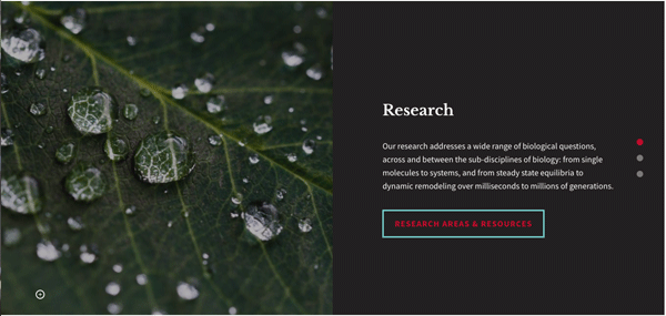
Spotlight (4 optional layouts)
There are four different kinds of spotlights: Video, Static Image, Fullscreen Video, and News & Events.
Fullscreen Slideshow
This section has an intro text area with a WYSIWYG toolbar. You can add slides, captions, and choose a background color for the intro section.
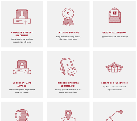
Resources Callout
Each resource card has a title, subtitle, icon, and link to a page or document with more information. All resource cards in this area will also be displayed on the Resource page. You can also add links to the red Additional Resources area blow the resource cards.
Second Content Block
This section is just like the First Content Block further up the page. This section is a basic WYSIWYG space. Its options include having a white or grey background and a choice of one or two columns. You can add video and photos, but it's also a great option for the wordier sections of your page.
Timeline
This section displays dates and slides on a timeline. Slides have the option of having background images. We recommend using dark background images because the text overlay is always white.
Gallery
The gallery is a great way to showcase a small collection of images. If you are looking for a photo gallery to house more than 3-6 images, we recommend using Flickr. Each image has a WYSIWYG to add a caption, information, or even a button leading to more information.
Faculty Bookshelf
If enabled, any books added to the site will display here. Optionally, you may set a specific category of books to display so that only books with a matching category tag will display on that particular bookshelf.
Additional Resources
A section designed to list links in two columns with a grey background. Each link has optional subtitle text and the option to open in a new window (if linking outside of the site).
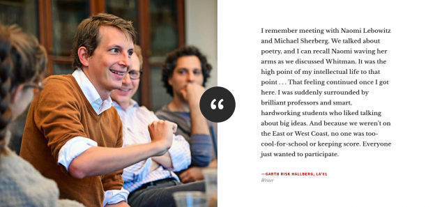
Testimonial
Select one from the available testimonials to display here.
Embedded Webform
Intended for use with very short forms. No more than 2 fields, please. If you need a longer form, we recommend building a separate webform and linking to it rather than embedding it.
Footer Callout
A final opportunity to ask a visitor to do something or to offer them more help finding what they need. This section has a button, an area to add social media icons, and a choice of a white or grey background.
Person
Person is a shared content type.
The "Person" content type is used to share information about the people in a department such as contact information, job responsibilities, research interests, publications, and more. You have a choice of a long profile (used for faculty) and a short profile (usually used for staff and graduate students). A person's profile page should reside in the "Employee Department" according to Workday. For faculty or staff who reside in multiple departments/programs/centers, only the primary department in which the page resides is able to edit the profile, but the profile can be shared on multiple other sites including artsci.wustl.edu, which lists all faculty in Arts & Sciences. Please make sure the profile is marked "shareable."
Where are some places a person profile can display?
- All published people will automatically appear on the People landing page.
- People profiles can be pulled into the people section of an individual course.
- People profiles can be pulled into the people teaser sections available in multipurpose pages and image cards.
Resource
Resource cards are a way to create organized, browsable links to other content, which can be a page in your site or on another website. A Resource can display on the Resources Landing Page and/or on a multipurpose page, with a graphic icon representing the information available.
Where are some places resource cards can display?
- All published resource cards will automatically appear on the Resources landing page.
- Resources can be pulled into the resource sections in multipurpose pages, image cards, and the image card landing page.
To make a Resource:
- Choose an internal title that will help you (and anyone else who edits in your website) to understand what content is represented in the card. Most of the time, this title can match the display title.
- Click "Browse" to choose an icon from the icons folder in your media library. Whenever possible, try to match the icons used on artsci.wustl.edu to be consistent.
- Enter the title that you want to display at the top of the card. Remember to capitalize the first letter in each word.
- Enter a subtitle. These should start with a verb, be all lowercase, and have no ending punctuation.
- Enter a URL.
- If the URL is pointing to an external website (not a page in your site), check the "New Window" box. This will cause the page to open in a new window, which is a best practice for website navigation that takes a visitor out of the current website.
- If applicable, choose a category for the resource.
- Save
Learn more about options on the Resources Landing page (including how to re-order resources) in the Landing page FAQs below
Testimonial
A testimonial displays an image on the left and a short quote on the right. For the quote, we recommend 1-2 sentences at most.
Where are some places testimonials can display?
- Testimonials can be pulled into the resource sections in multipurpose pages, the home page, image cards, and the image card landing page.
To Add a Testimonial
- Go to Add Content and choose Testimonial
- Fill in the required fields and Save
- Edit a multipurpose page (or home page) where you would like to display the testimonial.
- Scroll down to the testimonial section, select from the drop-down list of available testimonials, and Save.
Publications Page
The Publications page is a later addition to the web theme. It was designed to offer more options for sharing news and announcements, for example, it could be used for a department newsletter. The Publications page was designed with enough flexibility for other uses as well.
Course Pages
While you are not able to edit most of the content imported from the system of record (WUCRSL or Workday), you can add information to each course. For example, a course may be given an image and then "featured" at the top of the course landing page, courses can have links to course websites or to documents, and courses can be placed into categories to allow students and advisors to filter for specific requirements or paths. In addition to these enhancements to individual course pages, the courses landing page has some new options as well.
Learn more about course pages
The Toolbar (wysiwyg)

The First Six Tools
 Bold
Bold
Use this tool to make normal text bold (not recommended for headings).
 Italics
Use this tool to italicize text
 Left-align
Mostly used just to undo center-aligned text.
 Center-align
To align a paragraph to the center.
 Bulleted list
To create a bulleted list
 Numbered list
To create a numbered list.
Linking to Documents
Where to upload a document
When your site launched, we shared a box folder with you named something like "New (your department name here) Site Folders & Files." We made the owner of that folder a departmental account (as opposed to an individual person account) to ensure that the folder doesn't get deleted when a staff member leaves the university (we hope you don't leave- but we know it happens). We made you a co-owner so that you have full access to the folder and can share it with others in your department if needed. We strongly recommend that you use this folder for all of your attached documents.
Naming a document for success
When you link to a document stored in Box, you can update that document by uploading a new version with the same name. If you don't change the document name, it will create version 2 (v3, v4, v5, etc) in Box and that link from your website will not break. If you upload a new version with a different name, you'll need to make a new link and edit the website - so we recommend using a document name that doesn't include a date or semester. In other words "Student Handbook" rather than "Fa2019 Handbook."
How to upload and link to the document
-
Upload your document to the folder you use for website documents in Box.
-
Click the "Share" button
- In the new window that opens, click the toggle for "Enable shared link"
- Click the drop-down menu below the link and select the option for "People with the link"
- Copy the link
- Go to your web page and highlight the text that you wish to use as link text. Do not use general words such as "click here," instead describe what the visitor is going to get if they follow the link. For instance "Download a copy of the form."
- With the text highlighted, click on the link tool in your toolbar and paste in the link you copied from Box.
Linking to a Filtered View
What is a Filtered View?
If you click on one of the checkboxes at the top of your "Our People" page, you will be looking at a filtered view. Sometimes as you write content for a particular audience, you may find that you want to link to a filtered view of people, events, or articles.
When creating a link to a filtered view, the URL should be the page slug plus the category ids (comma separated). See below for examples.
- /people/list/88,94/
- /events/categories/491
- /news/categories/470
What is a slug?
A slug is the part of a URL that identifies a particular page on a website in an easy-to-read form. For example, on the Anthropology website, the Our People page is this url: https://anthropology.wustl.edu/people. The slug is "/people"
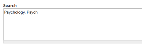
How do I find a category ID for People?
- Go to the filtered view that you have in mind. For instance, you could go to /people and filter for "current faculty."
- Click over to the list view (see image).

- You will see a number at the end of the URL. This is the category ID. In the example below, the category ID is 470.

How do I find a category ID for Events or Articles?
- Go to an event or article and view the page (not the teaser).
- You will see the categories listed in the top section, below the title. Click the category you want to link to.

- You will see a number at the end of the URL. This is the category ID.
Linking to an external website
When linking to a website other than your own, it's best practice to have that link open in a new tab or a new window. Here's a quick video demonstrating how to do this in three different circumstances:
Linking to unpublished content
Sometimes you might need to get approval for a new page before you publish it. Formerly, you would need to have the approver log into the website to view the unpublished page. We've added a module that allows you to share a secret link to unpublished content with a person who does not have a login on the website. Here's how to do it:
1. Save a page as unpublished
- scroll down to the publishing options tab
- deselect the "published" checkbox
- save
2. View the unpublished page. 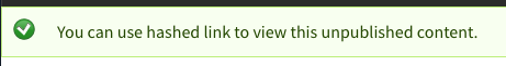
- You will see a message with a yellow background at the top of the page that reads "You can use hashed link to view this unpublished content."
- Click the words "hashed link" and the url of the page will change to something very long and complicated.
- Copy that long url and share it with the approver. They will be able to view the unpublished page without logging in.
Linking to a Course in Course Listings or the Bulletin
- Go to the bulletin
- Search for the course title
- Follow the link over to the course listings page and copy the URL
- Paste it into your web page
Alternatively, you can use this trick to manually create a link to a specific course in WUCRSL:
This is a link to the Modern & Contemporary Chinese Art Course: https://courses.wustl.edu/CourseInfo.aspx?sch=L&dept=L01&crs=3426
Notice that it uses the department number (L01) and the course number (crs=3426) in the URL. If you change those two numbers, you can use this address as a pattern to link to any other course.
More examples of the pattern:
https://courses.wustl.edu/CourseInfo.aspx?sch=L&dept=L14&crs=160
https://courses.wustl.edu/CourseInfo.aspx?sch=L&dept=L46&crs=313
Superscript and Subscript
 Use these to add a character that is slightly above or below the normal line of script.
Anchor Links
An Anchor link allows you to link to a section of the same page. In an FAQ page (like the one we are now), the links in the red sidebar are anchor links. In a multipurpose page, the links across the top links bar are anchor links.
The tool that looks like a flag in your toolbar allows you to create an anchor link anywhere on a page. Here's how to create a custom anchor link on a Multipurpose page:
Block Quote
 This has been styled to be a larger font that is centered on the page and is set off by horizontal lines above and below the text.
This is a block quote
Text Styles and Formatting Options
 Paste as Plain Text (A very important tool!)
Use this every time you copy/paste to remove all styles and formatting except paragraph returns. See the video demo below.
 Remove Format
Use to remove bold, italic, or underline formatting on text.
 Format pull-down
Use to select heading styles or normal font.
 Styles pull-down
Use to select the Red Headline style or the Button style. Note: the Button style is only available when your cursor is in the linked text.
How to Remove Accidental Text Styles or Formatting
Embed video
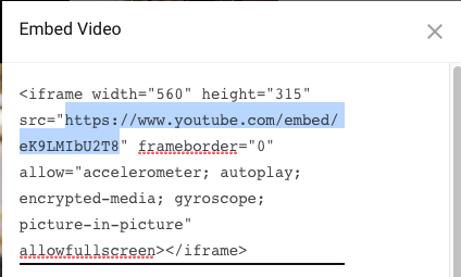
To embed a video, you must first upload it to YouTube or contact a member of the web team to upload to the YouTube channel we maintain for A&S departments.
The URL you will need to use is the one YouTube provides when you select the "Embed" option. First, select "Share" below the video, then select "Embed." It looks like this: https://www.youtube.com/embed/(your video's unique code)
- Select "Share"
- On the next screen select "Embed"
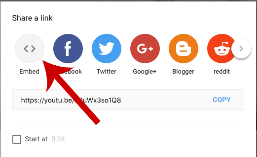
- On the last screen, copy the web address from the embed code
- While editing the page in your site, click the "Video filter" tool in the toolbar:

- Paste in the URL you copied from YouTube
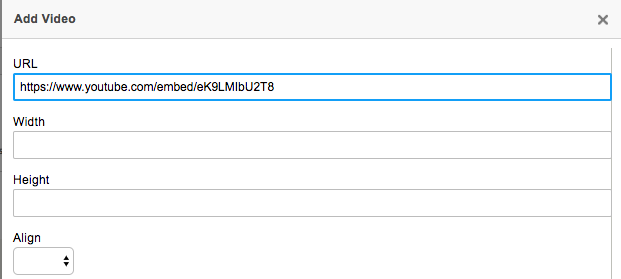
- You don't need to fill in the other fields - but feel free to, if you want to specify those options.
- Save
Add a Table

- Click the Table icon to add a new table
- Choose the number of columns and rows you will need
- If you like, change the other options such as border size, alignment, spacing, padding, or add a caption. In the example below, we selected "first row" for the header and provided a caption and a summary.
- The summary field is used by screen readers for the visually impaired and should contain a brief summary of the content of the table. It does not display visually on the page.
- Click OK to insert the table
- Copy/paste or type the data into the table
| Color | Make |
|---|---|
| Blue | Honda |
| White | Volkswagon |
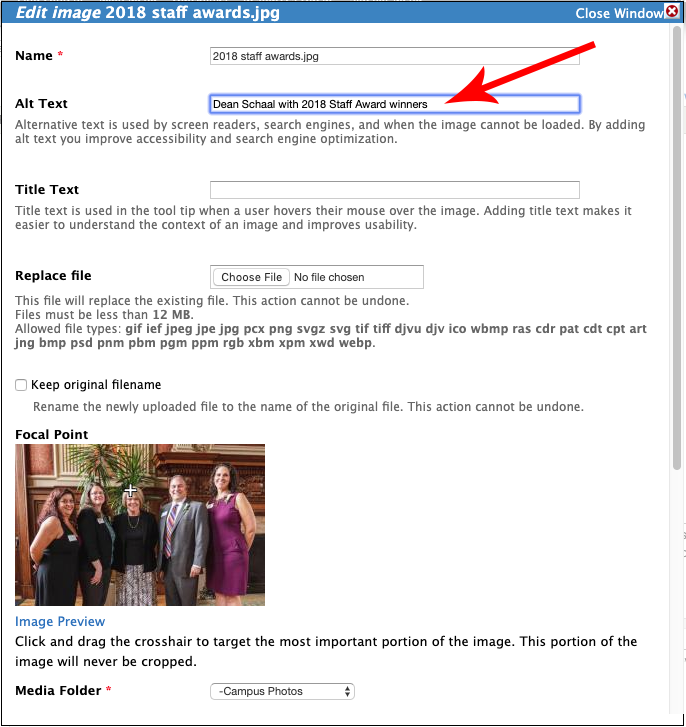
Insert an Image
- Click the Media browser icon to insert an image.

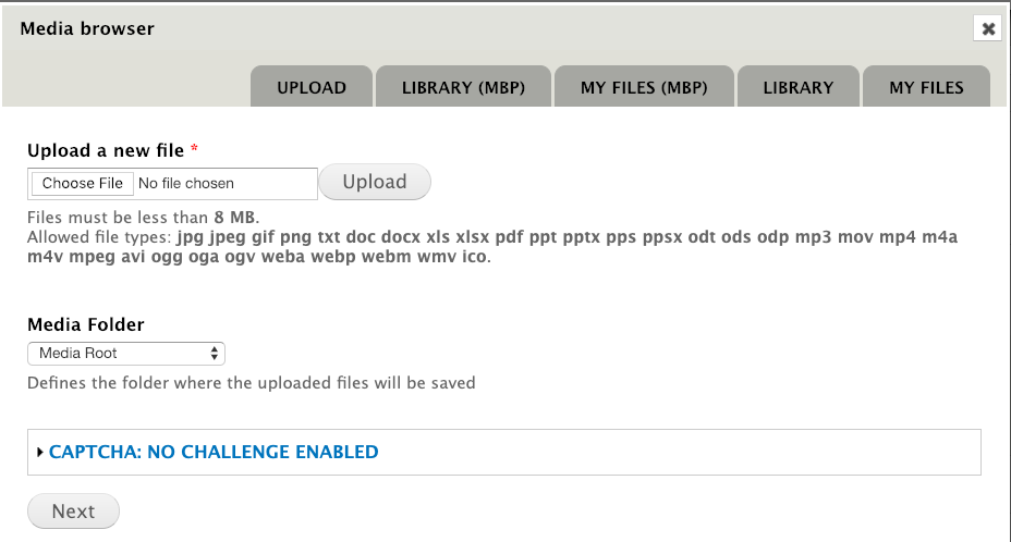
- You have two options.
- Option 1: Browse to your computer to upload the image
- Select a media folder in which to store the image.
- Add Alt text for the visually impaired.
- Submit
- Option 2: Click the Library(MBP) tab to browse and select from existing images in your website.
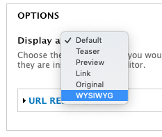
- On the Embedding screen, select Display as: WYSIWYG.
- Submit
- On the Embedding screen, select Display as: WYSIWYG.
Note: Once an image is inserted, you must save the page once before additional options become available.
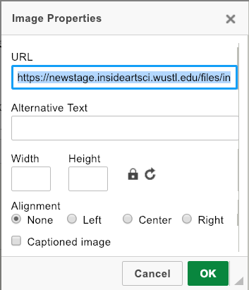
After saving, double-click on the image to open the image properties window. This window offers alt text, width, height, alignment, and caption options
Here is a short video demonstration:
Sharing Content
Content types available to share include Article, Event, Person, and Book.
How do I share an Article, Event, Person, or Book?
You can turn sharing on or off for a particular Article, Event, Person, or Book.
- Log in to edit the page
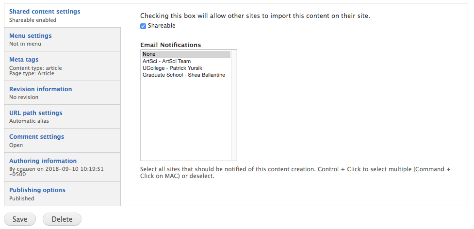
- Scroll to the bottom to the admin settings tab titled Shared content settings.
- Click the checkbox in front of Shareable to share the content. This will add your content to the feed of available items under "Shared Content" in other sites in the new Arts & Sciences theme.
- Optionally, you can send a notification to the content manager of another site by selecting them from the list under Notifications. Use this if you want to be sure another department knows about your new content.
How do I import an Article, Event, Person, or Book?
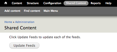
On the Shared Content page, click on the 'update feeds' button at the top of the page to make sure that you have the most up-to-date list of available shared content. Then, check the box in front of the content you wish to import, scroll to the bottom, and click the "Import" button.
Can I share or import content types other than Article, Event, Person, or Book?
Not at this time, however you should let us know if you think other content types would be useful to share.
I was notified about new content I'd like to import, but I cannot see it.
First, try updating the feed
Feeds will update to show new content every day at 6:00 am and 6:00 pm. If you want to manually refresh them sooner than that, follow these instructions:
On the Shared Content page, click the button to "Update Feeds"
Next, filter for the content
You may need to use the filter options at the top of the Shared Content page to find what you're looking for. If you know the title, try searching for it.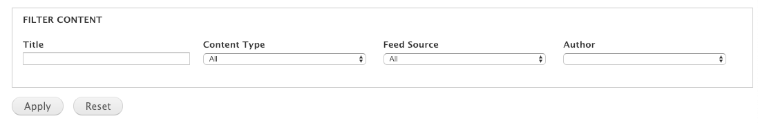
If I share something, will others be able to edit it?
No, they will not be able to change any of the content you created. However, they will be able to apply their own tags to make the content appear in the correct category within their site.
What happens if I delete content after someone has imported it?
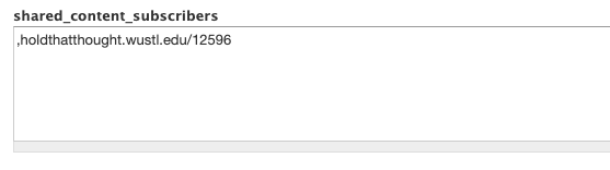
When the originating site deletes a piece of content, the content is not deleted from sites that have borrowed it. We recommend you contact the borrowing sites to ask them to remove it. Sites that have borrowed your content will be listed in the shared_content_subscribers box.
What happens when shared content is changed to no longer be shared?
That content will continue to be displayed on the receiving sites that already imported it but will not be available to be imported on any other sites. If you want the content to be removed from all sites, you must delete it.
How can I tell who has imported my content?
When editing the content, look for the shared_content_subscribers box near the bottom of the editing screen. It will list the addresses of any sites that have imported that piece of content.
How can I share events and articles with The Record or The Source?
Due to personnel changes in Public Affairs, there is no longer a person to whom events and articles may be automatically directed. For this reason, there is no longer a checkbox to "share with the Record," as in our old sites.
Events that are shared and published on the Arts & Sciences calendar are automatically submitted to Happenings, the university-wide calendar. If you have a particular event you'd like to promote, feel free to contact Marci Sullivan.
News Articles may be shared by sending a link to Sue McGinn at smcginn@wustl.edu
When I import a book, where does it display?
Imported books will automatically display on the faculty bookshelf as long as you are not restricting the bookshelf to only show a certain category(most do not).
For the book to display on a faculty member's profile page
- Edit the imported book
- Enter the person's name in the "Faculty and Staff" field
- Save
I imported something that has been updated on the original site but the update is not on my site.
Shared content is supposed to update automatically but we occasionally see a piece of content that just won't update. We're investigating the problem but if you notice this happen, the fastest resolution is to delete it and re-import it.
We would appreciate it if you let the web team know about this and any other anomalies you find!
Landing Pages
A landing page is a page designed to display teasers of other content such as people, events, or news. There is a filter near the top of the page to allow visitors to filter the content by tags that you designated when your site was designed. Additionally, a landing page has one or two editable regions such as a header image that displays above the filter or a footer callout that displays below the teasers.
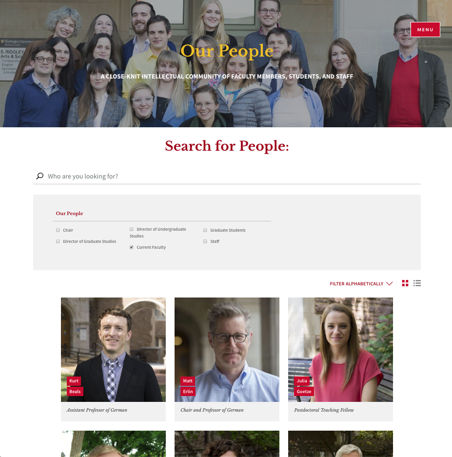
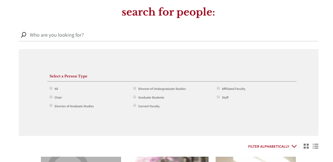
People landing page
The landing page that displays teasers of your Person content has an editable Introduction section where you can edit the headline, add a description, and a background image. You may change the overlay to be either dark, white, or red. If you select a dark overlay, your text will be white. For a white overlay, the text will be black. It is important to choose carefully for readability. You also have the option to show or hide an ampersand overlay on top of the image.
Visitors can toggle between "card" view and "list" view using the icons below the main filter. There is also the option to filter alphabetically.
Filter options
By default, a new site will have one set of filter terms for "Person Type." Person Type is meant to convey a person's role in the department, for example, Chair/Director, Current Faculty, Staff, Graduate Student, Research Scientist, etc.
Any changes to taxonomy/filter terms can be sent to the web team.
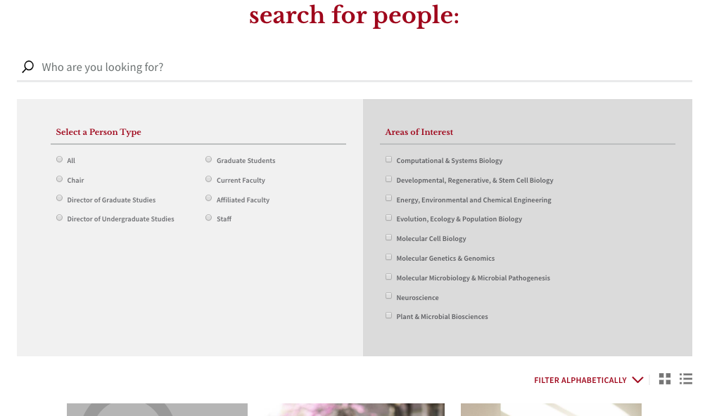
Optionally, the web team can enable a second set of filter terms on your landing page, "Areas of Interest," that can be used to group people into their research areas or areas of specialization. Any changes to taxonomy/filter terms can be sent to the web team.
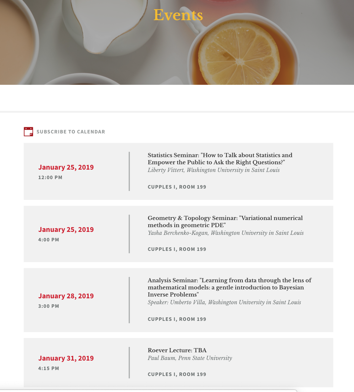
Events landing page
This page can be set to display event teasers as a list (text) or as cards (images). The web team can change that display option for you at any time.
If you select the List layout, it is important that your events use text in the "Intro Text" field because there is a space for it to display and the landing page looks empty and unbalanced without it. Even though this layout doesn't display a thumbnail image, you will still need to add one in case your event is shared with a department that uses the Card layout.
If you select the Card layout, it is important for your events to have thumbnail images. Without a thumbnail, the default ampersand image will display. This looks fine occasionally interspersed with other images but does not look very nice when there are a lot of them.
Any changes that need to be made to the event taxonomy/filter terms can be sent to the web team.
By editing the events landing page, you can add or edit the footer callout at the bottom of the page.
Any event that has the checkbox selected for "Promote to events landing page" will display in a slideshow at the top of the page in place of the default image.
To change the default image that displays at the top of the events landing page, contact the web team.
Subscribe to Calendar:
Below the search bar, there is a 'subscribe to calendar' icon that allows you to add all of the department's events to your default calendar. As new upcoming events are added to the department calendar, they will also be added to yours.

To subscribe to a calendar, click on the 'subscribe to calendar' link. This will open your default calendar application and allow you to subscribe to all of the events.
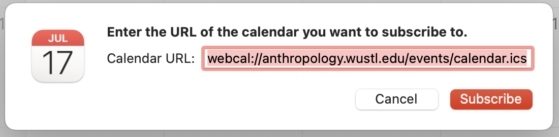
Note: Depending on what you are using for your default calendar, these steps may be slightly different.
News landing page
This page can be set to display article teasers as a list (text) or as cards (images). The web team can change that display option for you at any time.
If you select the List layout, it is important that your articles use text in the "Teaser text" field because there is a space for it to display and the landing page looks empty and unbalanced without it. Even though this layout doesn't display a thumbnail image, you will still need to add one in case your event is shared with a department that uses the Card layout.
If you select the Card layout, it is important for your articles to have thumbnail images. Without a thumbnail, the default ampersand image will display. This looks fine occasionally interspersed with other images but does not look very nice when there are a lot of them.
Any changes that need to be made to the event taxonomy/filter terms can be sent to the web team.
By editing the news landing page, you can add or edit the header image at the top of the page or the footer callout section at the bottom of the page.
Image cards landing page
This page will display all of the published Image Cards in your site.
You have the option to add or edit the image a the top of the page. You can select a headline and a description to display over the image. You may change the overlay to be either dark, white, or red. If you select a dark overlay, your text will be white. For a white overlay, the text will be black. It is important to choose carefully for readability. You also have the option to show or hide an ampersand overlay on top of the image.
Any changes that need to be made to the event taxonomy/filter terms can be sent to the web team.
Visitors can toggle between "card" view and "list" view using the icons in the upper right corner.
The card view is ordered by the "authored on" date of each card. The list view is ordered alphabetically.
To re-order the cards
- Edit an image card and scroll to the vertical tab section at the bottom.
- Select the tab named Authoring information
- Edit the "authored on" date. Earlier dates are first, later dates display lower on the page. This date does not display to site visitors.
- Save
Courses landing page
This page will display a feed of course information from the Course Listings system. You may edit the header image, title, and subtitle that display at the top of the page. You can now also add a featured courses section.
Any changes to taxonomy/filter terms can be sent to the web team.
Resources Landing Page
To Re-order Resource Cards
Resources are ordered by date (most recent at top) on the Resources landing page. The date does not display to visitors.
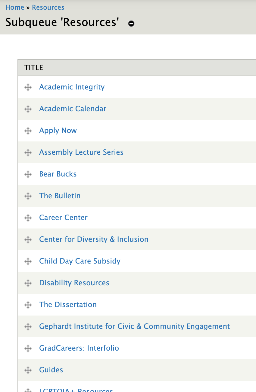
Resource Queue method:
- Any resources added to the queue will display in the order you place them.
- Click on "Resource Queue" in the grey shortcut bar.
- Start to type the name of a resource then select the one you want from the list that pops up.
- Drag the resources into the order you want them to appear.
Any resources that are not in the queue will appear after the ones in the queue. They will display ordered by authoring info date.
Changing the date method:
- Go to find content and click "edit" next to the Resource you wish to re-order
- Scroll down to the authoring information tab at the bottom and change the date.
SEO and Search
Search Engine Optimization is about helping search engines understand and present content.
To improve your serving and ranking:
- Put useful content on your page and keep it up to date.
- Write useful and descriptive titles.
- Ensure that all pages on the site can be reached by a link from another findable page.
- Think about the words users would type to find your pages, and make sure that your site actually includes those words within it.
- Use text instead of images to display important names, content, or links.
- Use Siteimprove to
- Find and fix broken links
- Find places where you need to use <alt> tags on images.
- Correct misspellings
The Search Field
On many types of content, there is a "Search" field available. Adding a word to this field will affect the internal site search results. If a word is entered into that field, regardless of whether it is in the content of that page, the internal site search will place a higher weight on that page when someone searches for that word.
For example, when searching the term "Psychology" on artsci.wustl.edu without adding that word to the search box of any pages, the returned search results will put "Philosophy-Neurosciences-Psychology" at the top of the results because the word "Psychology" is in its title. It would put the page title "Psychological and Brain Sciences" further down the list because "Psychology is not in the title (though it is used in the body of the page). Adding that term to the "Psychological and Brain Sciences" page causes it to be higher in the search results when a visitor searches for the word "Psychology."
User Roles
There are several levels of access available to users of your website. If you are the primary manager of content on your website, you will have the "SiteStaff" role. There may be others in your department who help you with parts of the website. The other roles were designed with that in mind.
Training is needed for all website users and will be tailored to the role assigned. If you need to add a new user to your website, contact the web team and let us know which role you would like to assign. We will contact them to schedule their training.
Other things you will need to contact us for help with:
- Add/edit/remove categories (tags)
- Change type of layout on Events or News Landing pages
- Add or remove social media icons in your footer
- Set up a feed from Twitter or Instagram on your home page
- Change the default image at the top of the Events landing page
Editor
This role may...
- Edit or Delete any Article, Event, or Person content where they are assigned as the author
- Skip Comment Approval
- Edit Own Comments
- Edit Metatags
- View Revisions
- Revert to Revisions
- Create new Events
Intern
This role may...
- Edit Own Comments
- Edit Metatags
- Create new/Edit own Articles
- Create/ Edit any Book, Event, Person
- Delete own Book, Event, Person
- Use Media Browser
Media Manager
This role may...
- Administer Files
- Use Media Browser
Web Forms
This role may...
- Create/Edit any Webforms
- Access all Webform results
- Edit all Webform submissions
URL Path Manager
This role can be added onto the SiteStaff role in circumstances that require access to these features. This role may...
- Create Redirects
- Create Custom URL Aliases
Site Staff
This role may...
- Manage Shared Content
- Create/Edit/Delete any content
- Publish/unpublish any content
- Promote/un-promote to/from the home page
- Administer Comments and Comment settings
- Skip Comment approval
- Edit/Delete/Download any Files
- Use Media Browser
- Administer Menus and Menu items
- Edit Metatags
- Change the author of the content
- View/Revert to/ Delete Revisions
- Create/Edit/Delete Webforms
- Clone any content
- Create/Edit URL Aliases
- View Site Reports
- Access/Edit/Delete Webform submissions
- Create/Edit Publications Page
Viewer
This role is unique to the Graduate School Department Portal and the Artsci Advising Forum, which are private.
The "Viewer" role may be assigned to an account to allow them to see and interact with the site content. For example, see page content, fill out forms, and download documents.
Page Settings
When editing a piece of content, there is a collection of page settings in tabs at the bottom of the editing screen. Most of these options are the same across all types of content.
Exceptions to this are the Shared content settings (only available on sharable content) and Menu settings (not available on some types of content that should not go into a menu, such as events).
Depending on your user role, you may only see some of these options.
Shared content settings
You can turn sharing on or off for a particular Article, Event or Person.
- Log in to edit the page
- Scroll to the bottom of the admin settings tab titled Shared content settings.
- Click the checkbox in front of Shareable to share the content. This will add your content to the feed of available items under "Shared Content" in other sites in the new Arts & Sciences theme.
- Optionally, you can send a notification to the content manager of another site by selecting them from the list under Notifications. Use this if you want to be sure another department knows about your new content.
Menu Settings
To add content (basic page, multipurpose page, etc.) to the menu, scroll to the bottom of the edit form and check "Provide a menu link" under the menu settings tab at the bottom of the edit form. This will expose additional fields related to menu settings. As a best practice, a site should never have more than seven links in any single menu level.
URL Path Settings
The first time content is saved, Drupal automatically generates a nice URL alias based on the title.
To create a custom URL alias for a page
-
Click on the vertical tab at the bottom of the edit form labeled 'URL path settings' and uncheck the "Generate automatic URL alias" box if it is checked (if not, that’s fine)
- Edit the page name as needed and save.
- Note that you should only add the last part of the URL you desire. So if you want https://graduateschool.wustl.edu/international-cost-estimates, then only enter “international-cost-estimates” in that field.
- The old url will redirect to the new one automatically. There is nothing you need to do to make that happen.
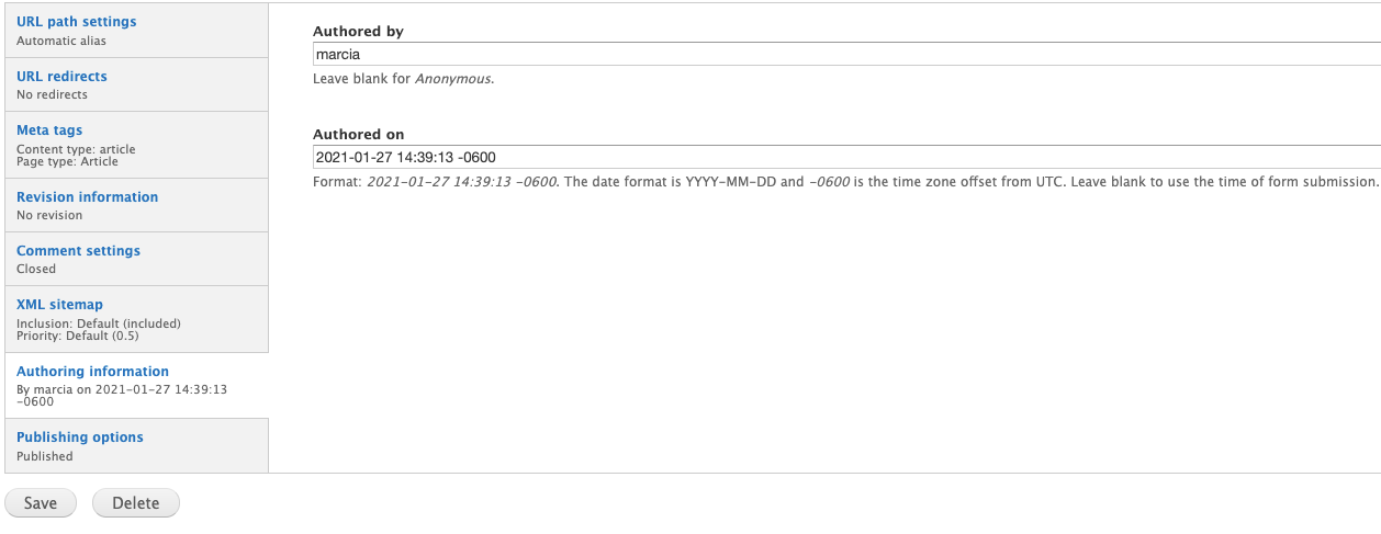
Comment Settings
By default, comments will be turned off for all new content.
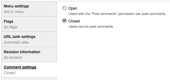
You can open comments on any individual article. This will allow visitors to comment on that particular article. To disable comments on an article, go to the edit form for that article, click on "comment settings" in the vertical tabs at the bottom, and select "Closed." (See image below.)
To approve comments made on your site, you may browse to the article containing unapproved comments and click "approve" or you may approve comments in bulk on the comment administration page. To view a full list of unapproved comments and approve or delete them, click "find content" in the shortcut bar, click the "comments" tab, and then click "unapproved comments" at the top of the page.
Revisions
What is a revision?
A revision is a saved earlier version of a page.
Once a page has been saved, the next time you edit the page, you can save the unchanged version of the page as a revision. You can save as many revisions of a page as you like. There is no limit.
Saving a revision is helpful if you think you may need to quickly revert back to the page as it was prior to your changes.
How to make a new revision
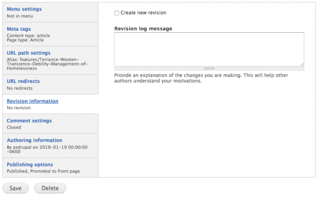
- A revision can be created by editing a page and opening the Revision Information tab near the bottom of the page.
- To save your changes as a revision, select the checkbox in front of Create new revision. Optionally, you can create a log message for yourself (or your co-workers) to note what you changed in this revision.
- You can make as many revisions as you like - there is no limit.
How to find and use a saved revision
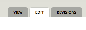
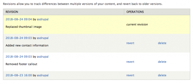
Once a page has at least one saved revision, a new Revisions tab will appear at the top of the page when you are editing it. Select that tab to see a list of all revisions and log messages for that page.
On the Revisions tab, you will see saved revisions listed with the date, time, username, and log messages in the left column and options to either revert or delete in the right column.
To preview a revision without actually reverting to it, click the date. After reviewing, use the browser's back button to return to the list.
Meta Tags
Meta Tag options are available in a tab at the bottom of every page when you are logged in and editing.
Basic Tags
- Title and Description will be filled in automatically. The other options in this section are not necessary.
Advanced Tags
- Some of these will be filled in automatically. For most sites, this is all that is needed.
Open Graph
- These control how Facebook, Pinterest, LinkedIn, etc interpret the site's content. We recommend customizing the content description field in this section for articles that you want to promote. This will optimize sharing on social media.
- This is specifically for API use - which most of our sites don't need.
Twitter Cards
- Choose the Twitter card type option that best describes the way you want the content of the page to be displayed when shared on Twitter.
- Most of the important fields in this section will be filled in automatically, but you may need to fill in your Twitter account if it did not exist at the time the site was created.
Google+
- Don't worry about this section since there are specified tokens in place by default.
Authoring Information
This tab allows you to edit the author of a page. This is useful if you have a user with the "Editor" role because editors are only allowed to edit their own content. Just make that user the author of any page you wish to permit them to edit.
Publishing options
Un-check the "Published" option to save a page as unpublished.
Accessibility
The Arts & Sciences Drupal web theme already has a lot of accessibility built into the templates but we still need you, the content creator, to make our websites accessible. The following tips are based on a portion of the WCAG 2.0 standards developed by the World Wide Web Consortium (W3C).
Why make accessible websites?
Web accessibility is a basic human right. It means your content can be used as effectively by people with disabilities as it can by those without. This includes:
- people with a range of visual impairments
- people with hearing impairments
- inability to use a keyboard or a mouse
- learning disabilities
- language barriers
- people prone to seizures
- people with limited physical abilities
- lack of familiarity with computers
- Read stories on the Web Accessibility Initiative website about people with disabilities using the web.
Making your website accessible has other benefits.
- search engine optimization
- improved responsiveness (mobile-friendly design)
Legal compliance is important too.
- 2017 saw a refresh of Section 508, which requires that persons with disabilities have comparable access to and use of information and communication technology.
- Plaintiffs filed more website accessibility lawsuits in federal court for the first six months of 2018 than in all of 2017.
Make it Perceivable
Provide text alternatives for non-text content.
- Include alternative text for every image unless it is a decorative image (see below). Use brief descriptions of photos, diagrams, or charts to describe the content and how it relates to the text on the page.
- Decorative images don’t add information to the content of a page. For example, the information provided by the image might already be given using adjacent text, or the image might be included to make the website more visually attractive. In these cases, a null (empty) alt text should be provided (alt="") so that they can be ignored by assistive technologies, such as screen readers.
- Images that are links must have alt text that describes the landing page, preferably the page title and/or h1 text—not a description of the image.
- Keep text to “tweet length," 140 characters or less If the image needs further explanation, describe it in the inline text or a link to a separate page.
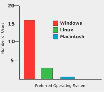
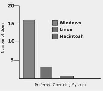
Use graphics that do not rely solely on color to convey meaning
Graphs and charts should use text labels and/or fill patterns rather than color alone.
Inaccessible Bar Chart
Below is an image of an inaccessible bar chart. Solid sections of red and green with similar brightness are used- which may not be distinguishable for colorblind users.
In addition, the only key to the chart refers to the colors, thus information is only conveyed by color. The greyscale version of the chart shows what a colorblind person would experience.
Accessible Bar Chart
The data from the first table has been redone as a bar chart, but the colors have been changed to shades of blue. Colorblind users can use the different levels of darkness to tell the platforms apart. In addition, labels for each platform have been added to the bottom of the chart, so that viewers do not even have to refer to the key.
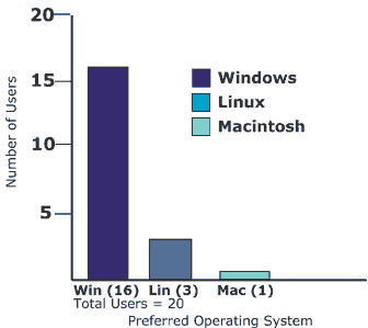
Credit for Bar Chart examples: Penn State Accessibility
Make it Operable
Make sure link text does not match taxonomy terms
This would result in identical link text that leads to different locations - which makes the navigation of your website unclear.
Give users enough time to read and use the content.
- Keep captions on moving slide images short and to the point.
- Offer visitors the option to stop slides to give them more time to read.
Do not use content that causes seizures.
Web pages must not contain anything that flashes more than three times in any one-second period. Keep this in mind when adding video to your site.
Make it Understandable
Make text readable and understandable.
- Web pages should have titles that describe the topic or purpose clearly and concisely.
- Page titles should be unique within a site. Duplicate page titles are confusing and will also harm your page ranking in search engines.
- Text should be supplemented with illustrations, videos, and other formats where appropriate.
Navigation and information structure should be discernible and consistent.
The purpose of each link should be able to be determined from the link text alone. Link texts should be written so they make sense out of context. Generic texts such as “click here” and “more” give no indication as to the destination of the links.
Instead, try "follow this link to see our list of all resources" This is because screen readers will offer visitors the option to simply hear a list of links on a page. The more descriptive linked text makes it easier for visitors to navigate through the list of links.
Proper heading hierarchy will ensure screen readers find and read the list headings in the correct order. Headings should be nested. The page title automatically gets Heading 1, so you won't be able to use it anywhere in your website using the Arts & Sciences 2018 web theme.
Heading 2
Heading 3
Heading 4
Heading 3 should only ever be used following a Heading 2. In other words, never use Headings to simply give a page larger text.
Web Accessibility Guide
Web & Digital Accessibility
Digital accessibility is the process of making electronic resources accessible to everyone, including people with disabilities. Digital accessibility encompasses web content but also includes non-web products such as hardware, software, assistive technology, and social media and mobile apps. Washington University strongly encourages that our digital content, including video, audio, documents, and multimedia meets the WCAG 2.0 AA standard when it will be used by students, employees, or the community.
Making web content accessible means ensuring all online assets, such as websites, multimedia, and documents are accessible to everyone. Beyond the disabled population, WCAG web accessibility guidelines can help all users have a better experience. For example, video captioning benefits both the hearing impaired and users in loud environments, adequate contrast helps anyone see a screen better in bright sunlight, and easy navigation benefits the user experience for all.
Learn about Web & Digital Accessibility
Web Accessibility Guidelines
Web accessibility ensures that online information is accessible to everyone and provides equal access to all users, including those with differing abilities, including visual, auditory, physical, speech, cognitive, and neurological disabilities. Making our web content accessible to people with disabilities also benefits others, including those with changing abilities because of aging or those in temporary situations that impede their ease of accessing web content. Providing accessible website design removes barriers to information essential to our faculty, staff, students, and the community.
Arts & Sciences web accessibility guide
Siteimprove and Accessibility Testing
Siteimprove is an automated tool used by Arts & Sciences that regularly crawls the department and center websites to monitor for several different types of problems and alerts site maintainers if any are found. It can provide information on analytics (page views, visitors, and traffic sources), quality assurance (broken links, misspellings), and accessibility (the ease with which a person with disabilities can access your site). You can also sign up for our Siteimprove training course available in Canvas.
Automated tools like Siteimprove can be set up to quickly analyze the code of many pages for certain issues and then generate a report. While this is quicker than manually checking a page or entire site, it can't tell you if the font is legible, the alt text is accurate, or headings make sense. Automatic tests save time and should be done regularly, but can't completely replace manual testing.
Other Accessibility Resources and Further Information
Learn how to make your department site more accessible and read our accessibility checklist.
Washington University Accessibility User Group (AUG)
General information and guidelines for accessible web design may be found on the W3C Website.
Web Accessibility in Mind (Web AIM) has a mission to empower organizations to make their web content accessible to people with disabilities.
EduCause Review of Section 508 Refresh
Webforms
First, a note about security:
None of the data submitted through webforms is encrypted, so webforms should never be used to collect sensitive information. If your site is public, the files uploaded through a webform are also technically public. (If someone knows the URL, they can access the files).
Create a Webform: Basic Steps
- Click “Add content”
- Choose webform
- Title your webform
- Click "Provide a menu link," if desired
- You may want to give it a nice URL alias.
- Click Save. You will be taken to the form components options.
- Add questions (form components) to your form.
- Click on “form components” under the “Webform” tab. (You will be on the correct page automatically if you just created a new webform.)
- Enter the text for each input field in the textbox under label.
- Select the desired field type from the dropdown. (See more below.)
- Check ‘mandatory’ if a field should be required.
- Click ‘Add’
- A new page with additional options will display. If this is a basic textfield, you can usually leave everything on the default settings, scroll to the bottom of the page, and click “save component.”
- After adding all form fields, set up e-mail notification if desired.
- Under the webform tab, click “e-mails.”
- Enter each e-mail separately in Address field and click ‘Add’ after each.
- If you have added an e-mail form component to your form, you can select it using the “component value” option and send an email to the form submitter as well.
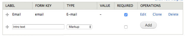
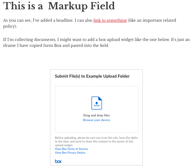
How to add intro text at the top of a form
You can create some introductory text at the top of your form by using the component type "markup."
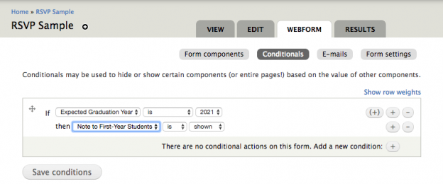
Conditional Fields
You can display fields, pages, and fieldsets conditionally based on the values that someone filled out on the form.
The steps for creating a conditional statement:
- Create a component that will determine what the visitor sees, such as Expected graduation year (select list).
- Add at least one more component following that, such as a custom Note to first-year students (markup).
- Click the Conditionals button near the top of the Webform tab.
- Use the If/then statements to create a conditional rule (or many).
- Click Save conditions.
Private Fields
Want to collect submissions and then add additional administrator-only data as well? (Status, review, etc.) Each form component is public (visible to anyone who can submit the form) by default, but there is a checkbox for marking a component "Private". (See image below)
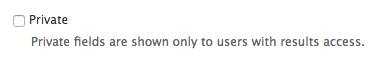
When the private checkbox is checked, only users who can view the form results will see the form field. One example use would be to track the status of an application. Example steps:
- Create an application form with all public-facing form components (name, e-mail, etc).
- Add a select option field for application status. Options could be something like "Pending", "Accepted", and "Rejected". Make sure to set the field as required with "Pending" as the default.
- Mark the field as private.
- Visitors filling out the form would not see the status field, and when the form was submitted, the field would be blank.
- An administrator with result access could log in, review the submissions, and update/edit each submission to mark them as accepted or rejected.
Accessing Form Results
Option 1: Have form submissions sent to you by email.
You can set up the form to automatically e-mail a certain address every time someone submits the form. This is good for forms that require a relatively quick response or that exist for a very long time (e.g. Computing’s “Classroom Request” form).
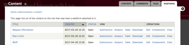
Option 2: Log into the website to retrieve form submissions.
- Click on Find Content
- Click the Webforms tab on the upper-right
- To view the submissions in your browser, click Submissions next to the appropriate form -or- to download the results to Excel, click Download.
For surveys or RSVP forms (forms with a set end date), using the Results tab may be more practical. (See image below.)
Every time someone submits a webform, a new record is created in the results. You can see a list containing the date and time of each submission. You can also view the results of each submission individually by clicking ‘view’ in the Submissions list. Alternatively, you can view a table of all responses by clicking ‘Table’. (This is only practical in forms with a small number of fields.)
You may also export your results to Excel by clicking ‘Download.’ We recommend that you download form results to Excel to store a copy and then clear the form results in Drupal at least once per year to keep the number manageable.
Form Components (Field Types)
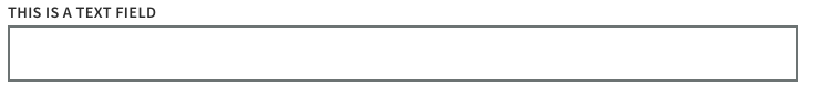
Textfield - A one-line box for unformatted (no bold/italics) text. (e.g. Name)
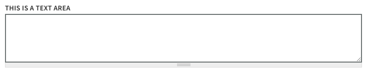
Textarea - A multiple-line box for text with no character limit. (e.g. Comments)
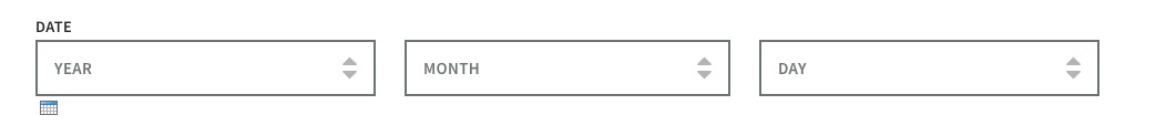
Date - User must choose a date (submission date is collected automatically – so no need to add this if that’s all you need to collect). You have the ability to show a pull-down select list for Year, Month, and Day or any combination of those options.
E-mail – Valid email address format. If you want to send your submitters a copy of the form submission, it’s best to use an actual email field versus a textfield.

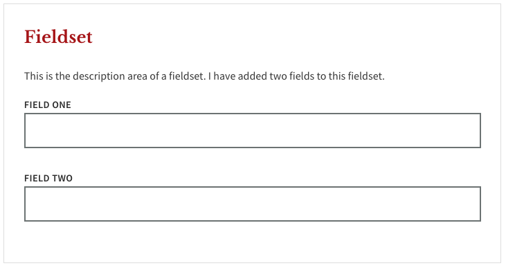
Fieldset – groups related fields within a page. Fieldsets are themed with a thin border. They can also be collapsible, a nice way to make a really long form less daunting. You can add descriptive text at the top of each fieldset. To place fields within a fieldset, you need to drag fields so that they are indented under the fieldset name – similar to moving menu items under a ‘parent’ item in the menu administration.
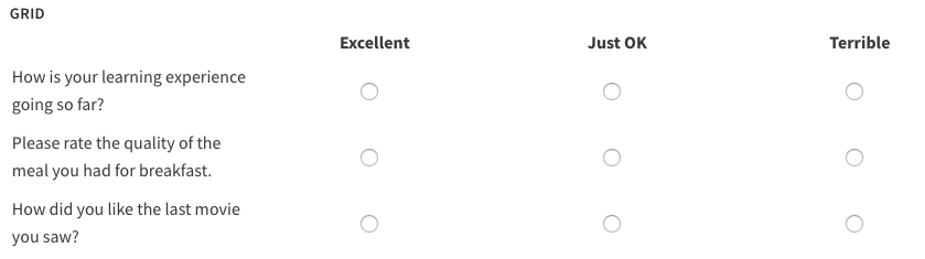
Grid - Provide multiple questions that the user can rate on a given scale such as 1-5 or "bad, OK, good" Displayed as rows in a table.
Hidden - A field that is not displayed to the submitter with data you want to collect that can be automatically generated. Note: This is probably something you will never need to use.
Markup – This is for entering a description at the beginning of a form page or mid-way through a form.
Number - Only allows numeric values and can be displayed as a textfield or select list. You can specify a valid range.

Page break – allows for multi-page forms. The “Next Page” button can be customized.

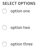
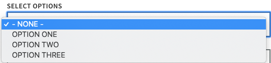
Select options – These are for dropdowns, radio buttons, and checkboxes – anything where you need to give the user a set list of choices. The interface for configuring select option fields is substantially improved in Drupal 7.
- If you don’t configure the select field at all, it will display as a radio button field. (User can only select one option.)
- If you check ‘Multiple’, the select field will be displayed as a list of checkboxes. (User can select multiple options.) Note – if you want a single checkbox, you still need to select multiple – just only provide one option.
- If you do not check ‘Multiple’ and instead check ‘Listbox’, you will get a dropdown. (User can only select one option.)
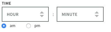
Time - The 'time' component of date.
____________
File – Only enabled on specific sites. It is extremely important for the security of our shared server that if you use a file field you limit allowed file types to only images, PDFs, and Word documents. You should also limit file size. This is configured on a per-field basis which is why we don’t enable it on all sites. Uploaded webform files are public. They can be accessed directly at the file URL if someone knows it, so you should not be accepting files containing sensitive information. If you have a form that accepts files, make sure to periodically clear your old form results to remove those files, especially if those files contain student work. (Results->Clear)
Spam Discouragement - Add a Captcha
Enable Captcha
- Go to Find Content
- Click the Webform tab
- Select the title of the form to view it as a visitor would - from the front end.
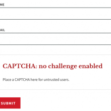
- Scroll to the bottom and click the large red text "CAPTCHA: No challenge enabled"
- Smaller text reading "place a CAPTCHA here for untrusted users" will appear. Click on that text to open a page with CAPTCHA options.
- From the pull-down, select any of the CAPTCHA types. The default type is set to "math" which offers the visitor a simple math problem to solve.
- Save
Un-publish or close the form when no longer needed
The longer a form is public, the more likely it is that spammers will find it. So if the form is just a temporary survey (even if you might re-use it later) and the survey period is over, it's a good idea to un-publish it. You can always republish it at a later date for a new (or the same) survey. Alternatively, you can close the form to prevent further submissions. This is also a good usability to make it clear to your visitors that you are no longer collecting RSVPs or survey results.
To close a webform and prevent further submissions,
- Go to Find Content
- Click the Webform tab
- Select Form settings next to the form in question
- Set the status of the form to “closed”
- Scroll down and Save the configuration
- Do NOT delete form components to prevent further submissions. When you delete a form component, all submissions in that form field are also removed.
How to enable file uploads to box
First, log into Box
- Create a folder in Box
-
Click the ellipses to see options and select "File Request." A smaller window will open.
-
Select "Edit" to make any customizations to the widget, such as a custom title, subtitle, required email address field (helpful for identifying who uploaded files to this folder!), or other required field types.
-
Save those changes and return to the "File Request" screen
-
Next to the "Upload Embed Widget" script, click the "Copy" button.
Next, open your webform for editing
- Add a new form component of the type "Markup" (name this anything you like- the title is not visible on the form)
- You will see a WYSIWYG toolbar area. In the lower-left corner, select "Disable rich text.
- Paste in the code you copied from Box
- Save
Watch this five-minute video demo:
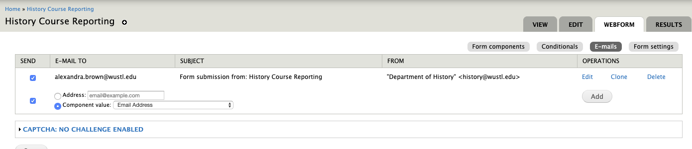
Email your Form Submissions
- Log into the site, go to Find Content->Webform tab to find the webform, and click on Edit
- At the top of the window, you'll see tabs "View", "Edit", Webform", and "Results." Click on Webform.
- Click the grey E-mails button to add or edit the email addresses the form submissions will be sent to. Having the form email automatically is an option. The submission results are available to check under the results tab.
- Scroll down and save your changes.
Conditional Recipients
You can send submissions to different e-mail addresses based on what value a submitter chose in a select field.
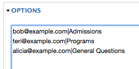
Let's say you are a department that has one contact person for admission questions, another for programs, and finally someone who receives general questions. To automatically route form submissions to the correct individual:
- Create a required select option form component called something like "subject".
- Add the 3 areas as options.
- Customize the option keys to be the e-mail addresses of the 3 individuals. Note: the keys must be unique, so the same e-mail cannot be used more than once! Click on Manual entry in the lower right corner of the Options box (see image)
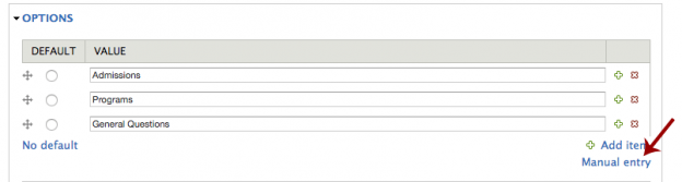
- Type the email addresses followed by a pipe (vertical line symbol) | and then the option (see image below). The key for each option must be unique and should only contain alphanumeric characters - no spaces or special characters. (@ is an exception.) For simplicity, do not use capital letters.
-
Save the component
-
In the e-mail settings, choose the "subject" component as the "e-mail to" value.
Email a copy of the form submission to the person filling it out
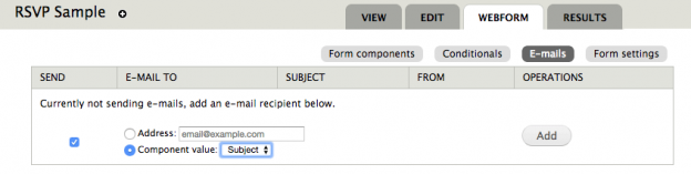
This can be useful when you are asking for RSVPs or in any case where you want the form filler to be reminded of what they submitted.
- Log in to edit the webform
- Click the “Webform” tab at the top
- Select the grey “E-mails” button just below that:
- Instead of adding an email address, click the radio button in front of “component value” and choose the “Email Address” field from the pull-down. This will email the form results to whatever address the person filling the form types into that field.
- Click Add
Pro tip:
The default template used when emailing form submissions includes a couple of sentences that will not be useful to a person who cannot log into the website. You may want to delete the following lines from your template:
- Submitted by user: [submission:user]
- The results of this submission may be viewed at:
[submission:url]
Organizing your Webform
There are two main ways to group fields:
- Fieldsets – groups related fields within a page. In newer sites, fieldsets are themed with a thin border. They can also be collapsible, a nice way to make a really long form less daunting. You can add descriptive text at the top of each fieldset. Note: to actually place fields within a fieldset, you need to drag fields ‘under’ the fieldset component – similar to moving menu items under a ‘parent’ item in the menu administration.
- Pagebreaks – allows for multi-page forms. (Note: if you are allowing file upload – only enabled on certain sites – file fields must be on the last page of a multi-page form.) The description at the top of the page will continue to be displayed on each page of the form.
Both of these are added as form components despite not really being form fields. One way of thinking about these is that fieldsets ‘hold’ collections of fields and page breaks are the submit buttons at the bottom of each page in a multi-page form.
Control the Width of a Field
Note: do not try to use these CSS classes on grid or select option fields, as they layout best when left alone.
By default, each field in a form will go the full-width of the page. If you want certain fields to be shorter and next to each other (rather than above/below), do this:
- Log in
- Navigate to the view of form components by going to Find Content and selecting the Web Forms tab at top.
- Next to the webform you wish to edit, click on Components (You will be on the correct page automatically if you just created a new webform.)
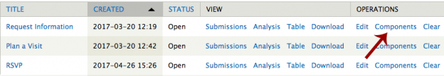
- Edit the component (field) you wish to shorten
- In the Wrapper CSS Class field, type "half."
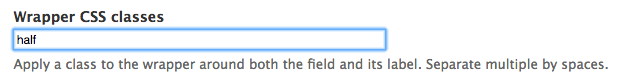
- If you do this to two adjacent fields, they will appear in the same row.
Other options that will work:
- one-third
- two-thirds
Form Best Practices
- Not in use? Close it under webform->form settings.
- Do not allow users to submit the form if they are not eligible. (e.g. Close the form when an application period is over or when you are no longer accepting survey responses.)
- Keep it short.
- Group related fields together visually. (e.g. contact information)
- Put all required fields at the top together.
- Use specific options instead of open-ended text boxes where ever possible. (Less work for your users!)
- Make the length of the text box or text area reflect the content. For example, the box for a 6 character ID should only be 6 characters wide.
Customize the Confirmation Message on a Webform
- Log in and navigate to Find Content -> Webforms tab
- Select Components to the right of the form you wish to edit
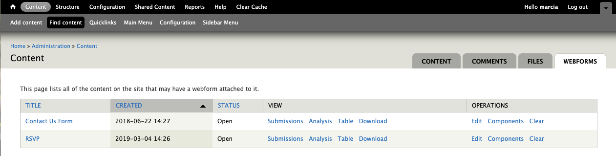
- Select the Form Settings button from the upper-right of the window.
- Edit the confirmation message and Save.
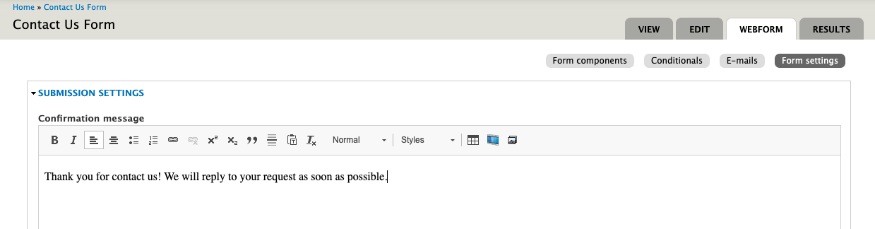
Scheduling a Webform to Automatically Unpublish
To schedule a date and time for your webform to automatically unpublish, go to the Scheduling Options tab and fill in the date and time fields.
Images
Working with images can be a challenge! We have a few FAQS below that will help. For more help and detailed information, check out our Website Image Guide.
If you have questions about how to resize and crop your photos or what resizing tool you should use, check out our Resizing Images for the Web Guide.
Minimum Sizes for Images
First, a caution regarding image sizes
Each section with the option to upload an image (a "Browse" button) is designed so that images must meet a minimum image size to display correctly (or at all, in many cases). This does not mean that you need to resize a larger photo down to this minimum size. In fact, we suggest using a photo larger than the minimum size so the focus tool will work properly.
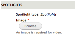
If you click "Browse" and upload an image from your computer, you will see the minimum size displayed below the upload button. If you choose an image that doesn't meet the minimum, you will receive an error message.
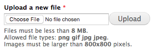
However, if you navigate to the media library to browse for an existing image instead of uploading a new one, it is possible to choose one that does not meet the minimum size and you will not get the error message. If an image that does not meet the size requirement is selected in this way, it will appear on the back end (in editing view) but will not display on the front end (what site visitors see).
Minimum Sizes for Images:
Article
Header Image: 1366 x 548 pixels
Thumbnail: 600 x 600 pixels
Basic Page
Intro Background Image: 1366 x 480 pixels
Book
Book Cover: 200 x 450 pixels
Courses
Banner Image: 1366 x 480 pixels
Featured Course Image:
Event
Header Image: 1040 x 526 pixels
Thumbnail: 600 x 600 pixels
Image Card
Thumbnail: 600 x 600 pixels
Multipurpose
Introduction Background Image: 1366 x 480 pixels
Main Content and Sidebar Icon: 420 x 300 pixels
Video Spotlights with Articles Image: 800 x 800 pixels
Dark Callout Image: 800 x 800 pixels
Spotlight - Video Image: 800 x 800 pixels
Spotlight - Static Image: 800 x 800 pixels
Spotlight - Fullscreen Video Image: 1366 x 800 pixels
Fullscreen Slideshow Image: 1366 x 800 pixels
Timeline
Header Image: 1366 x 480 pixels
Static Slideshow Image: 600 x 600 pixels
Slide Background Image: 600 x 600 pixels
Gallery Image: 600 x 600 pixels
Person
Headshot: 684 x 684 pixels
Testimonial
Testimonial Image: 680 x 680 pixels
Controlling Thumbnail Images with the Image Focus Tool
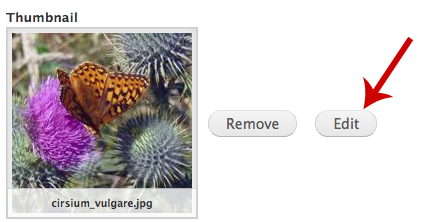
- Edit the page where the thumbnail is being used.
- Edit the thumbnail image.
- You will see an image preview with a little plus sign + in the center. Wherever you place that plus sign becomes the center of the thumbnail image. This becomes more important when the image used is rectangular but will display as a (square) thumbnail.
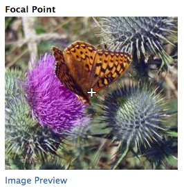
Note: In order for the focal point tool to work properly, you will need to use an image that is larger than the minimum requirement. The bigger the image, the more leeway the tool will have to work.
Guidelines for taking Photos for your Website
General guidelines for images of people (for profiles or testimonials)
When the student or alumnus is not able to be photographed on campus, we would like to ask them for a portrait that is well-lit, in focus, and shows them from the waist up with margins on the left, right, and top.
Adding an image next to text
Your Administrative Tools

Content (Find Content)
Clicking on Content in the black admin toolbar takes you to the same page as clicking on Find content in the shortcut bar.
You will see a list of all of the content in your website, ordered by the most recently-updated. You can use fields at the top to filter for a word in the title, to filter by content type, author, or by published/ not-published.
Clicking a column header will reorder the contents by that column.
- Title: The title of the page
- Feed Source: displays a URL when that content has been imported from another website
- Type: The content type (Basic Page, Event, Article, etc)
- Author: The account used to create the content
- Published: Displays "yes" or "no"
- Updated: Date and time of the last update
- Operations: A quick way for you to edit or delete a piece of content
- Clone: To make a clone of an existing piece of content (you will want to rename it after cloning).
- Authored On: This shows the original date the page was created.
Content: Comments Tab
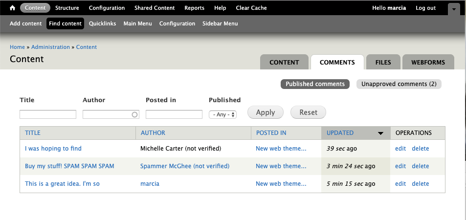
Comments are closed by default.
You can learn about enabling comments on a page in the Page Settings section of this FAQ.
To manage comments
- click the Comments tab at the top of the Find Content page.
- The default view is of all comments. To just see the comments pending approval, click unapproved comments at the top of the page.
- To approve a comment, click the title, which takes you to the page that was commented on (see image below) and then click approve, reply, or delete.
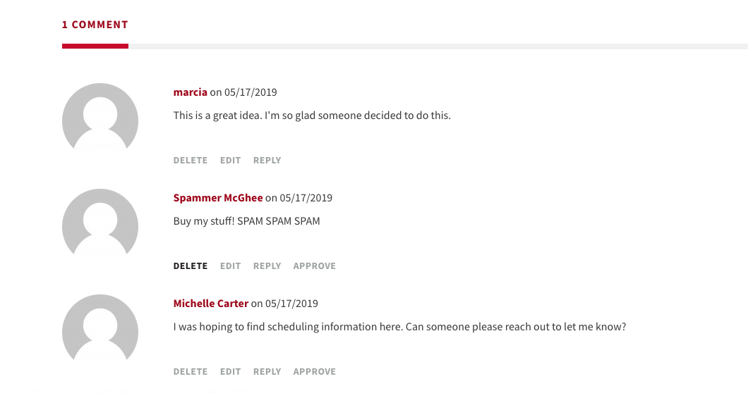
Content: Files Tab
In most cases, you will interact with image files via the Media Library, which is the tool you use when you click Browse to upload an image or click the Media browser tool in your WYSIWYG toolbar. Another way for you to browse your uploaded images is through the Files tab on the Find Content page. This view is also available from the Media browser tool.
The default view is named "Thumbnails plus" and is not usable at this time. Click over to the Files view to see a list of all image files as well as any files that were migrated from your old website.
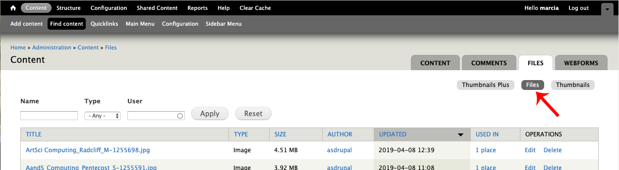
Content: Webforms Tab
This tab is a quick way to locate all of the webforms in your site. Form this view, you are able to see and download submissions, edit the title of the form, and edit the form components (the fields that make up your form). To learn more about creating webforms, check out the Webform section of this FAQ page.
Share a link to unpublished content
How to share a link to an unpublished page with a person who does not have a login on the website.
-
Open any unpublished page so that you are viewing it (not editing it). At the top, you will see a message that reads “You can use hashed link to view this unpublished content.”
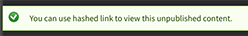
-
Click on the word “link” in that message and you will notice your URL up in the address bar will change to have a long complicated set of characters at the end. You can copy/ paste and send that hashed link to anyone (no need for them to log in) and they will be able to view the unpublished page.
Clear Cache
If you aren’t seeing changes or updates you've made to your website, these and many other issues can be fixed by clearing your website or browser cache. To clear cache in your website, simply click the ‘clear cache’ link in your admin toolbar. To clear your browser cache, choose your OS and browser and follow the step-by-step directions.
Menus
To add a link to a menu, edit the page, scroll to the bottom, and check "Provide a menu link" under the menu settings tab at the bottom. This will expose additional options related to menu settings. You can select a parent item to designate in which menu this link should display.
Some content types that should not be added to a menu, such as events, do not have this option.
Main Menu
- The main menu should have no more than 6 items.
- Items should fit on one line in mobile.
- These should be the most important landing pages in the site.
Gold Menu on Main Menu
- The gold menu (also called the secondary menu) should have no more than 8 items.
- Ideally, these are secondary landing pages (i.e.—news, events, courses, contact us).
Quick links (in the site footer)
- Should have no more than 8 items
Frequently Asked Questions
I made a change but it is not displaying in my site.
On any landing page (people, events, news, resources), you need to clear the site cache before you will be able to see a change (though any new visitors to that page would see it right away). There is a “clear cache” link in the black toolbar at the top of the browser when you are logged in.
How do I add, edit, or remove a category?
This is something you will need to contact the web team for help with. It's a quick task for us and we are always happy to make these changes for you!
How can I change the type of layout on Events or News Landing pages?
This is something you will need to contact the web team for help with. It's a quick task for us and we are always happy to make these changes for you!
How can I add or remove social media icons in my site footer?
This is something you will need to contact the web team for help with. It's a quick task for us and we are always happy to make these changes for you!
How can we set up a feed from Twitter on our home page?
This is something you will need to contact the web team for help with.
How can we change the default image at the top of the Events landing page?
This is something you will need to contact the web team for help with. Just send us the image you would like to use or let us know if you'd like us to find one with particular subject matter.
I imported something from another site but it doesn't look the same as the original.
The best first step to try is deleting the imported item and re-importing it. If you still see a difference, please contact the web team to report the problem.
I added people to the People Teaser section of a multipurpose page but they do not display.
There are two methods for selecting people to display in this section. You can either choose individual people manually by typing the names or you can select a taxonomy term to pull in all people profiles with that tag. You must use one method or the other - but not both. If you do both, then nothing will display.
I want to use a resource icon I saw on another website but it is not in my icons folder.
You can find all of the icons that have been created for the Arts & Sciences web theme in a shared box folder.
Where can I find the materials from a training session?
How do I include content from a website that does not use content sharing?
Content sharing is only available between Arts & Sciences websites at this time. If you would like to include a person, event, or article from a source outside of Arts & Sciences, you can use a Link field. We don't recommend "featuring" an event or article that is created this way, but it will save you some steps and the hassle of upkeep on content that does not belong to your department.
Here are the steps:
Person
- Navigate to Add Content and select Person
- Enter a Page Title, First Name and Last Name
- If you are able to get an image that's at least 684x684 pixels, add it. If not, the default ampersand image will display.
- Select the Person Type and Area of Interest tags, if needed
- Just below tags, you'll see the External Profile Link field. Copy and paste the link to the person's profile page (on the other website).
- Save
Event
- Navigate to Add Content and select Event
- Enter a Page Title, Date and Event Contact
- If you are able to get an image that's at least 600x600 pixels, add it. If not, the default ampersand image will display.
- Below the Event Contact field, you will see the External URL field. Copy and paste the link to the event page (on the other website).
- Save
Article
- Navigate to Add Content and select Article
- Enter a Title
- If you are able to get an image that's at least 600x600 pixels, add a Link Thumbnail. If not, the default ampersand image will display.
- Below the Authort field, you will see the Direct Link field. Copy and paste the link to the article (on the other website).
- Save
How long should I be able to stay logged into the website?
After you login with your WUSTL Key, the session will remain active for eight hours. It is possible that a network interruption or other interference could cause you to be logged out sooner than that, but eight hours is the longest amount of time your login will remain active. Contact the web team if you have problems staying logged into your site.
Is the "staging website" a safe place for me to try out changes?
- The web team uses the staging server to test out how we will deploy new features so you may encounter things there that are not yet available on your live site.
- The staging server is not necessarily the most stable environment (see above) so if you are working with a lot of new text, we recommend you write it (and save it!) in a document first and then copy that overusing the copy as plain text tool.
- The staging site is in the state it was in when your website initially launched – so recent content you have added in the live site will not be in this one.
- The staging website is a completely separate version of your site on a different server, so there is not a way for us to move any edits or new content from staging to the live site with the push of a button. Whatever you do on staging is just a trial run you will need to repeat on the live site.
- If it is simply edits to an existing page (not home page or landing pages), another option is to clone that page in the live site, unpublish the cloned page, make your edits on the unpublished version, and when you are happy with it, simply swap the published states and the URLS of the 2 pages
- If you are trying out changes on the home page or a landing page such as events or news, then it’s best to do those on staging rather than the clone method.
- The first time you go to the staging site, you will see a security warning. You can click through the warning to go to the site anyway. On Chrome, you would click “Advanced” and then “proceed to (the site url) anyway.”
How do I clear my cache?
To clear the site cache os that new content shows on landing pages and home page right away, click the "clear cache" link in your black admin toolbar at the top of the window.
To clear your browser cache follow these instructions:
Chrome: https://support.google.com/accounts/answer/32050?hl=en&co=GENIE.Platform...
- On the browser toolbar, click the Chrome menu icon.
- Select the Clear browsing data link.
- In the data drop-down menu, select the time range where you want to clear browsing data.
- Select the Cookies and other site and plug-in data and Cached images and files checkboxes.
- Click the Clear Browsing Data button.
Safari
https://support.apple.com/guide/safari/clear-your-browsing-history-sfri4...
Firefox
https://support.mozilla.org/en-US/kb/how-clear-firefox-cache
How do I log in?
You can log in by going to https://(yoursite).wustl.edu/user and clicking the red “log in with your WUSTL Key” button.